Product Design
The Scheduler
for OnlineMedEd
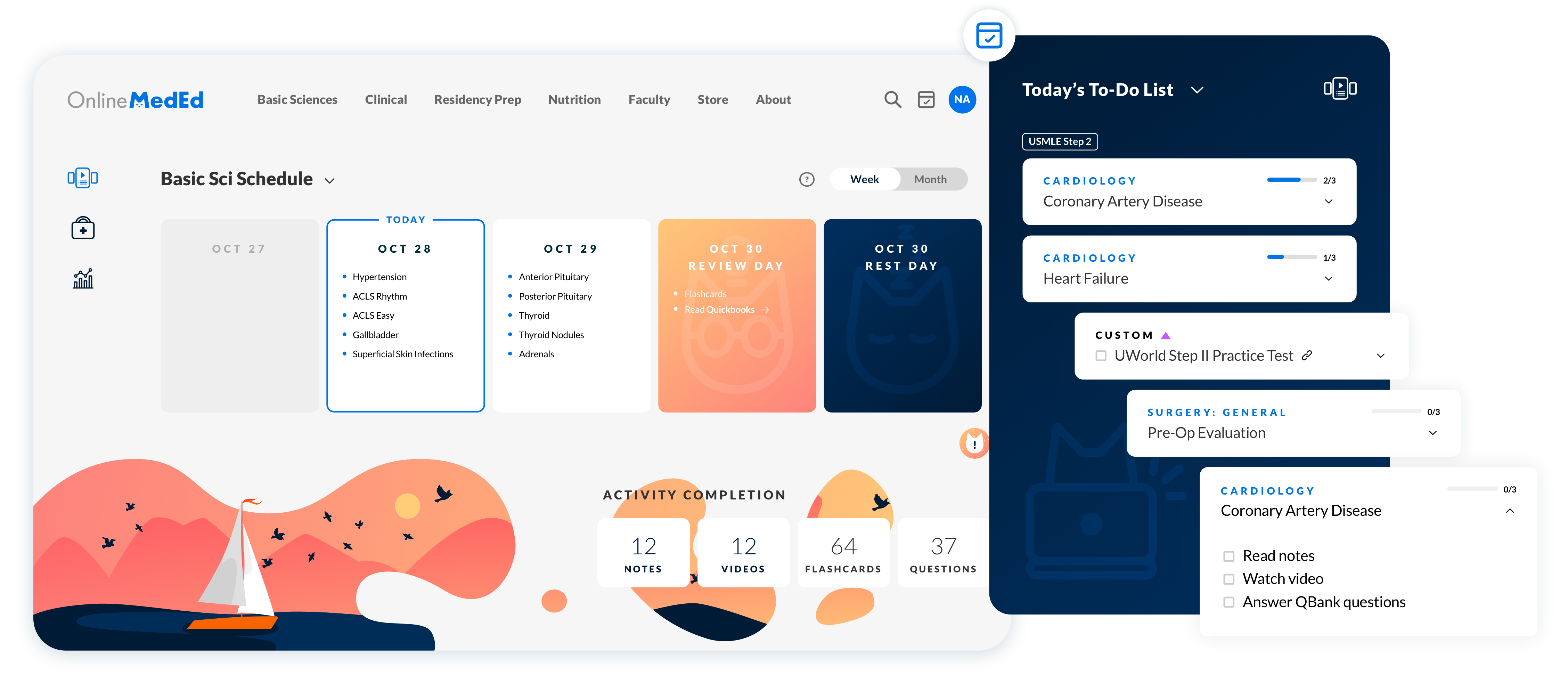
OnlineMedEd wanted to offer student learners a structured way to study, so we built a customizable scheduling tool with the goal of scalability and integration with other institutional content.
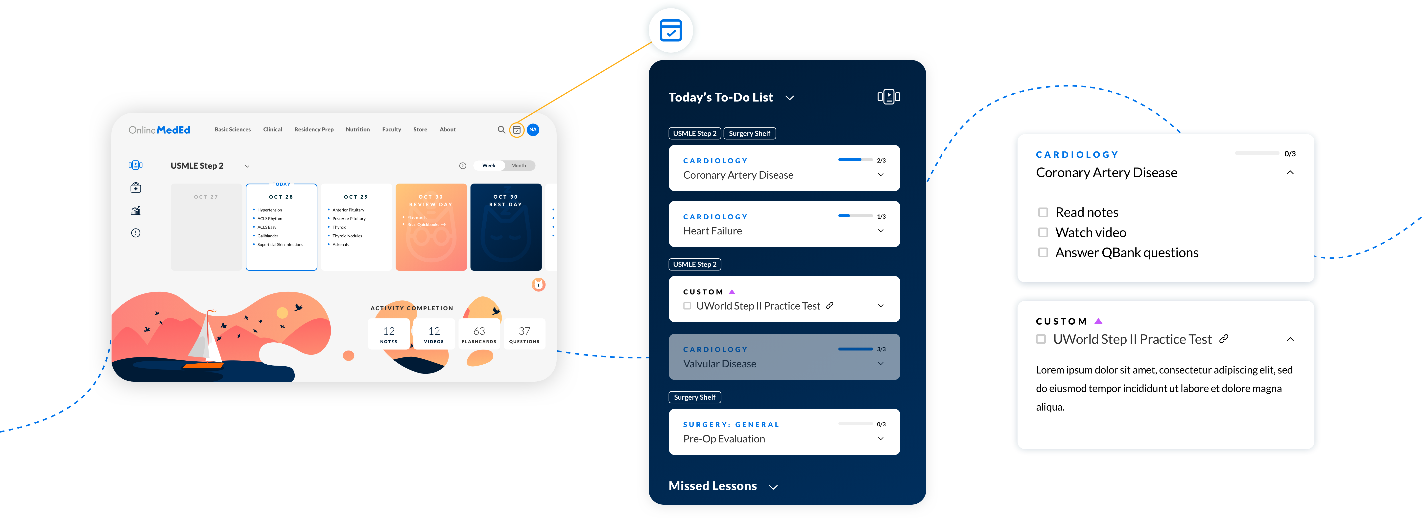
Users get daily to-do lists with prioritized lessons to jump into from anywhere on the site.
Overview
OnlineMedEd wanted to offer student learners a structured way to study, so we built a customizable scheduling tool with the goal of scalability and integration with other institutional content. Users get daily to-do lists with prioritized lessons to jump into from anywhere on the site.
The Team
-
4 Developers
-
2 Product Managers
-
1 QA Engineer
-
1 Product Designer (me)
My Role
- Lead Product Designer
- UX/UI
- Illustrator
Deliverables
- User Flows
- Wireframes
- Clickable Prototypes
- High Fidelity Designs
- Design Documentation
- Interaction Models
Other
- User Research
- Interview Scripts
- Illustrations
- Design System
Website
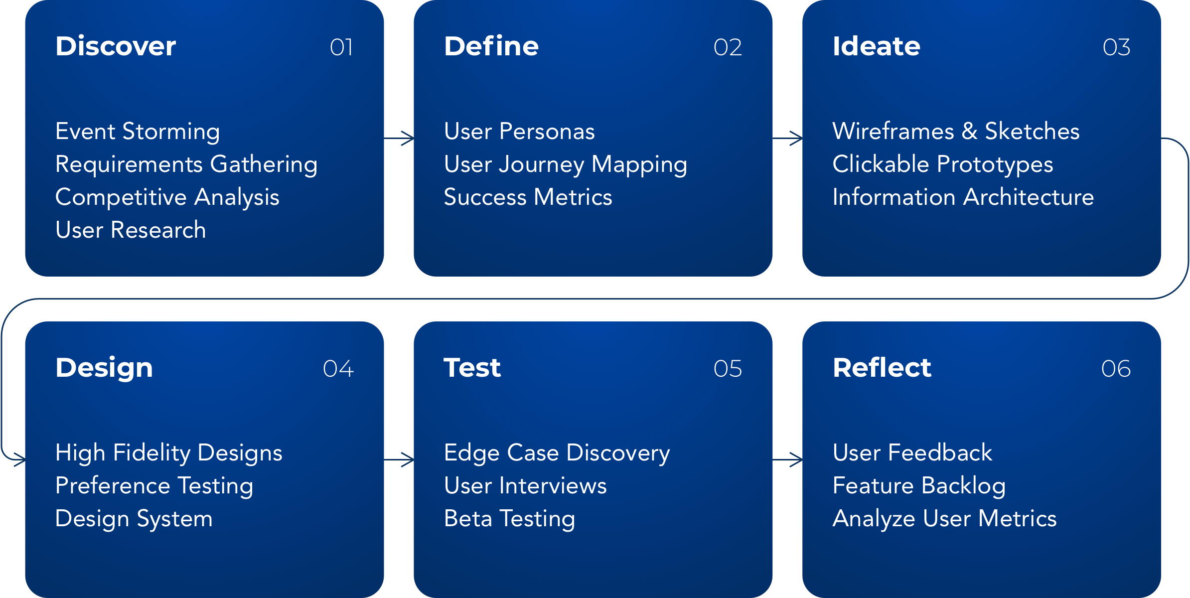
Project Info
Challenge
Many students struggle to balance their school work and clinical rotations while studying for exams. How can we prioritize our study content to show the user only what they need to know for their exams?
Despite having an extensive library of content offerings for each topic, students stuck mostly to consuming free videos and ignored other learning tools of OnlineMedEd’s “PACE” curriculum.
Solution
Increase user engagement with other content modalities beyond video
Create a schedule management platform that can grow to integrate custom or institutional learning curriculums
Approach
User Research
%
Med students use OnlineMedEd
%
Med students use multiple study tools
%
Users complete PACE curriculum for lessons
%
Institutions use OME for remedial lesson plans
Understanding the users
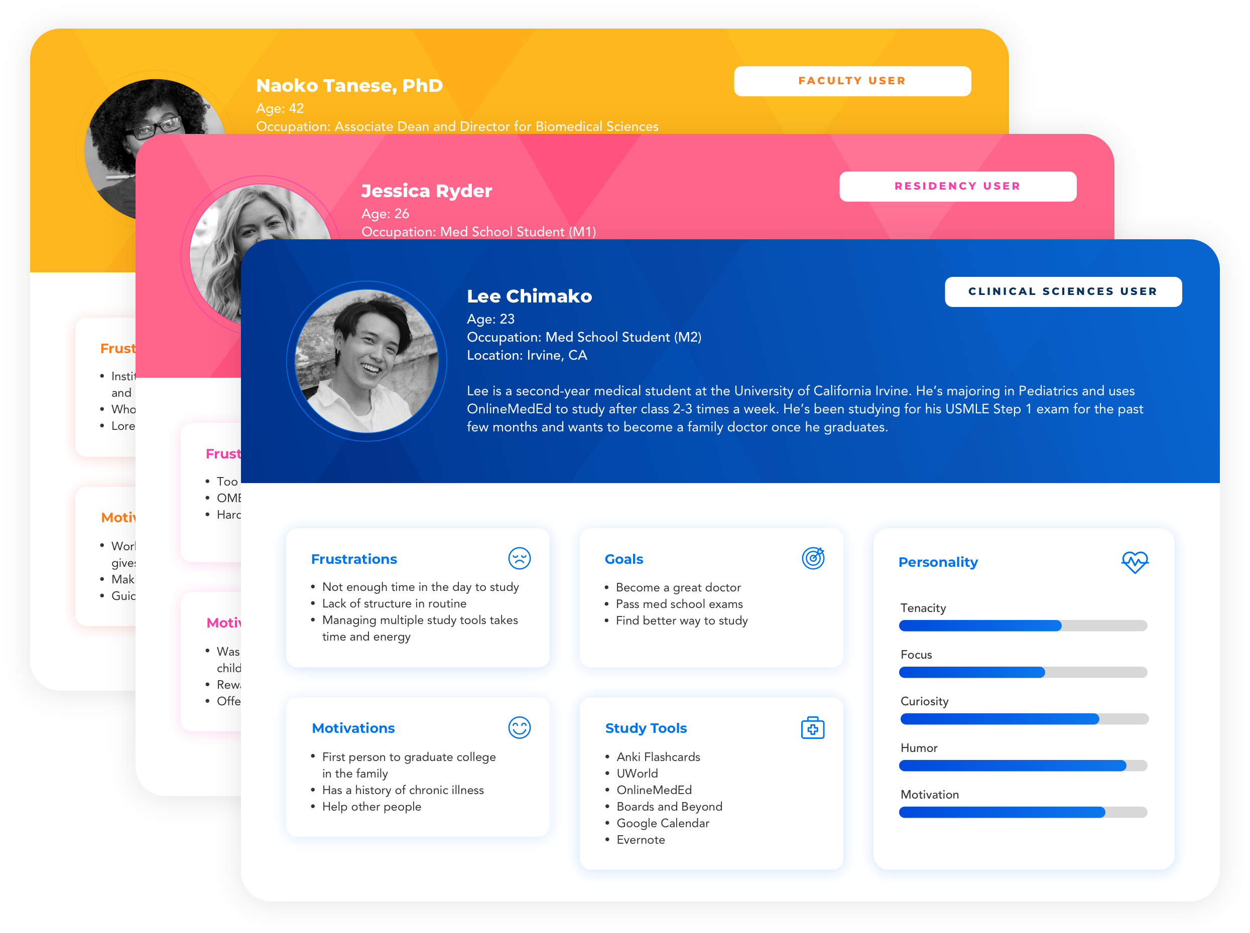
We compiled data from over 200k active accounts, crafted user personas, and formed a group of testers to help us iterate towards a scheduling product that will surprise and delight.
Key Insights
-
Different user types required unique preference questions in order to build a relevant schedule
-
Institution and Faculty users were interested in using the Scheduler tool to create study plans that map to their course syllabus.
-
Editing, sharing, and permissions capabilities were important to Institutional users.
-
Most users were navigating to lessons through drop-down menus, which required multiple clicks and page loads to get to any specific lesson page. To address this, I transformed the dashboard into a consolidated “to-do” list and displayed each lesson broken up into self-contained action items.
Knowing the users
We compiled data from over 200k active accounts, crafted user personas, and formed a group of testers to help us iterate towards a scheduling product that will surprise and delight.
Key Insights
-
Different user types required unique preference questions in order to build a relevant schedule
-
Institution and Faculty users were interested in using the Scheduler tool to create study plans that map to their course syllabus.
-
Editing, sharing, and permissions capabilities were important to Institutional users.
-
Most users were navigating to lessons through drop-down menus, which required multiple clicks and page loads to get to any specific lesson page. To address this, I transformed the dashboard into a consolidated “to-do” list and displayed each lesson broken up into self-contained action items.

Defining Success
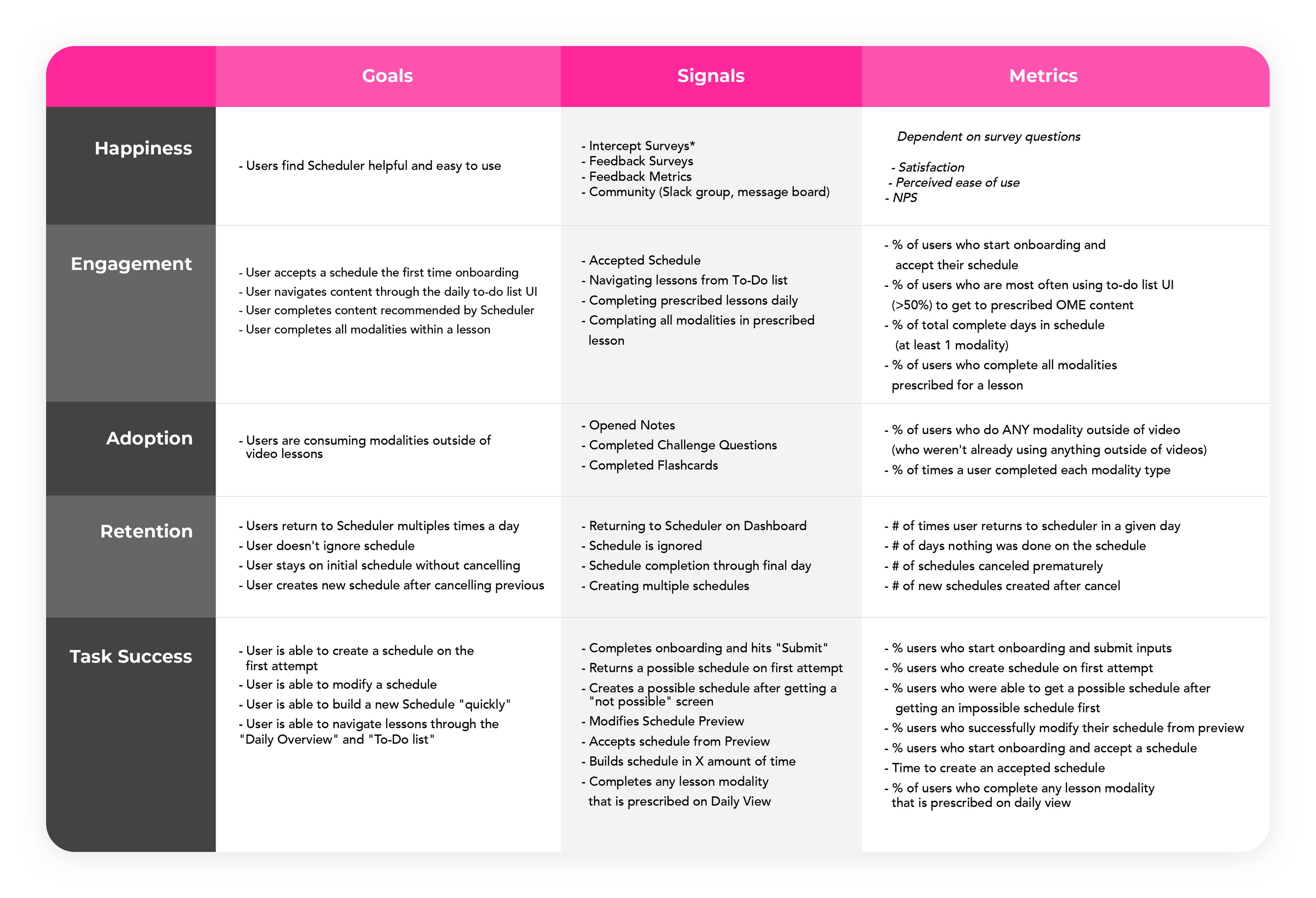
We used a HEART approach to define success metrics, framing growth through student utility and happiness with the product.
Defining Success
We used a HEART approach to define success metrics, framing growth through student utility and happiness with the product.

Define
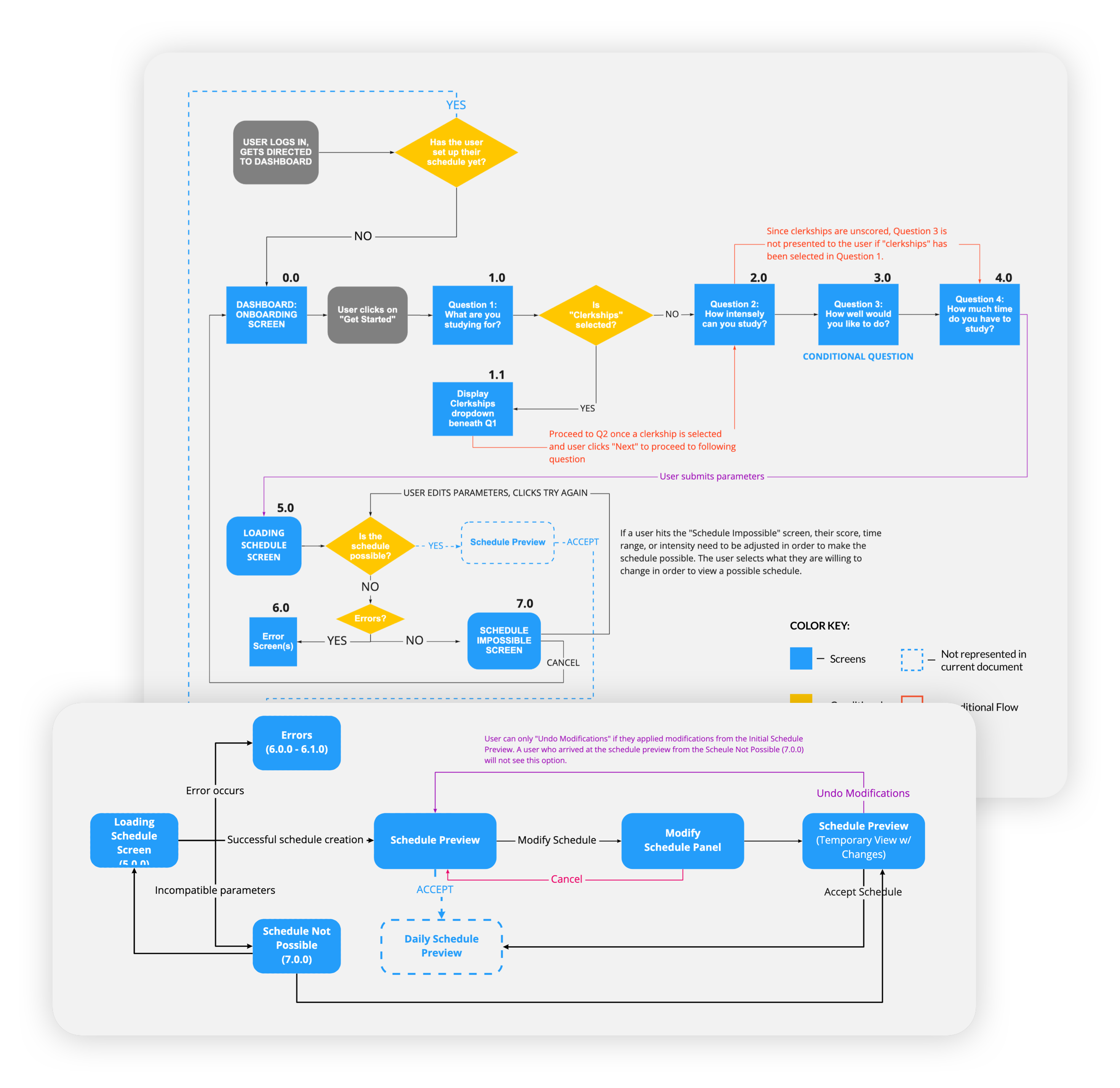
User Flows
How it works
To build a schedule, the user selects preferences in a series of 3-5 “onboarding” questions. The algorithm sorts lessons based on a proprietary rating system and the user’s onboarding criteria and then creates a preview of your study plan in the Editor.
Almost everything is editable within your schedule preview, so users can move content around, add “rest” days, or adjust the volume of assigned lessons. Once the user is happy with their schedule, they can save it and manage everything from their dashboard.
The to-do list follows the user throughout the site, so they can always access their next study task.


Ideate
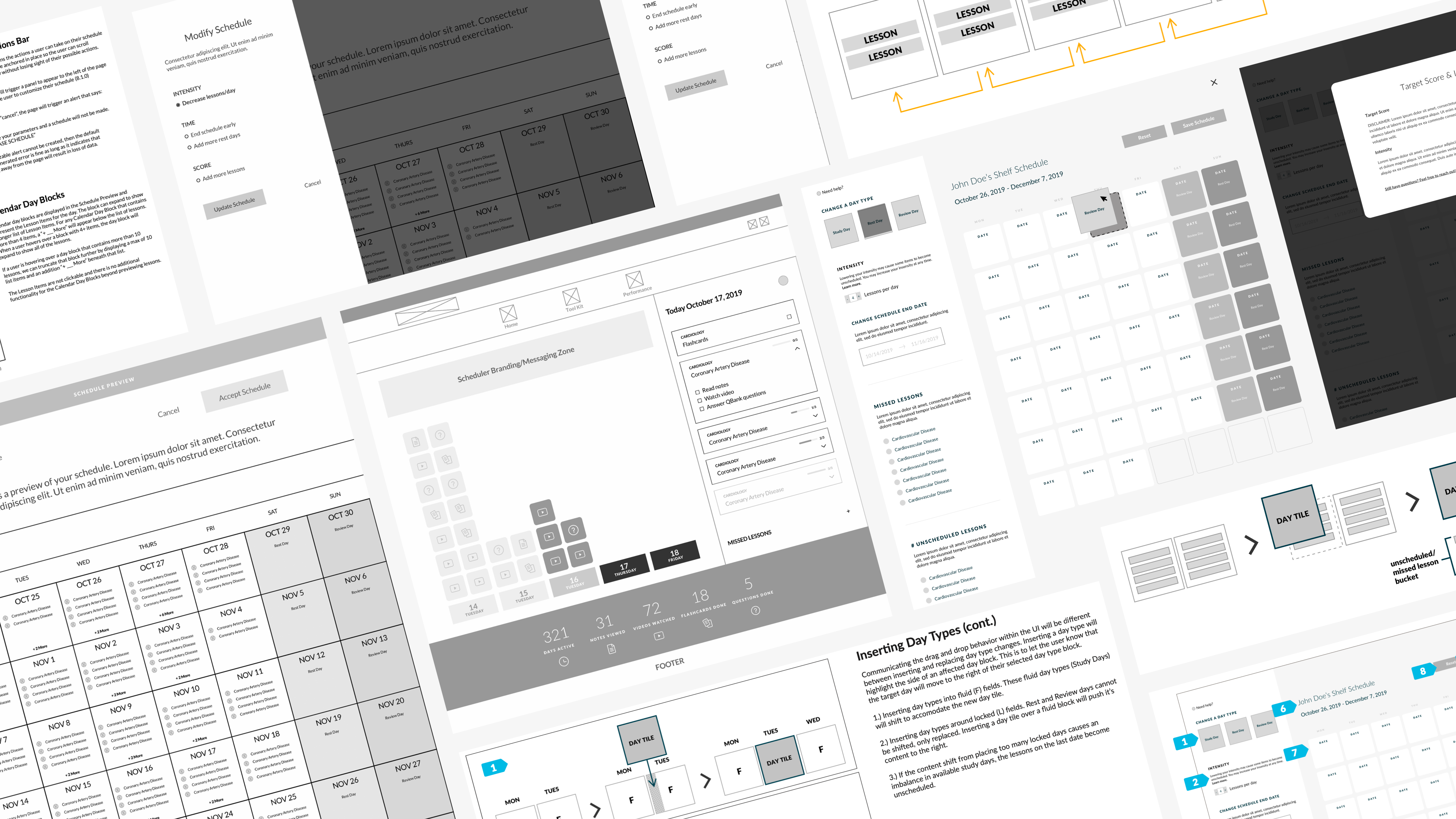
Wireframes
Design
High-Fidelity Designs
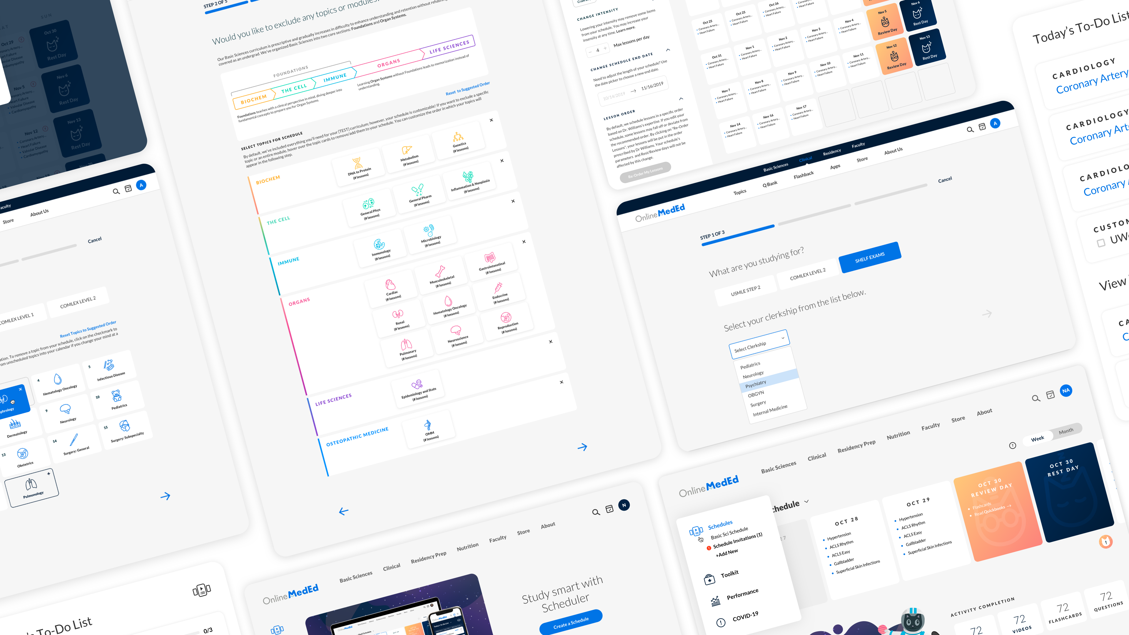
Onboarding Flows
Building the onboarding flow was the first step to creating a schedule. We ran into issues with algorithmic errors at first but developed an editing system that would fit content into a schedule regardless of the input criteria.
Onboarding Flows
Building the onboarding flow was the first step to creating a schedule. We ran into issues with algorithmic errors at first but developed an editing system that would fit content into a schedule regardless of the input criteria.

Scheduler Preview & Editor
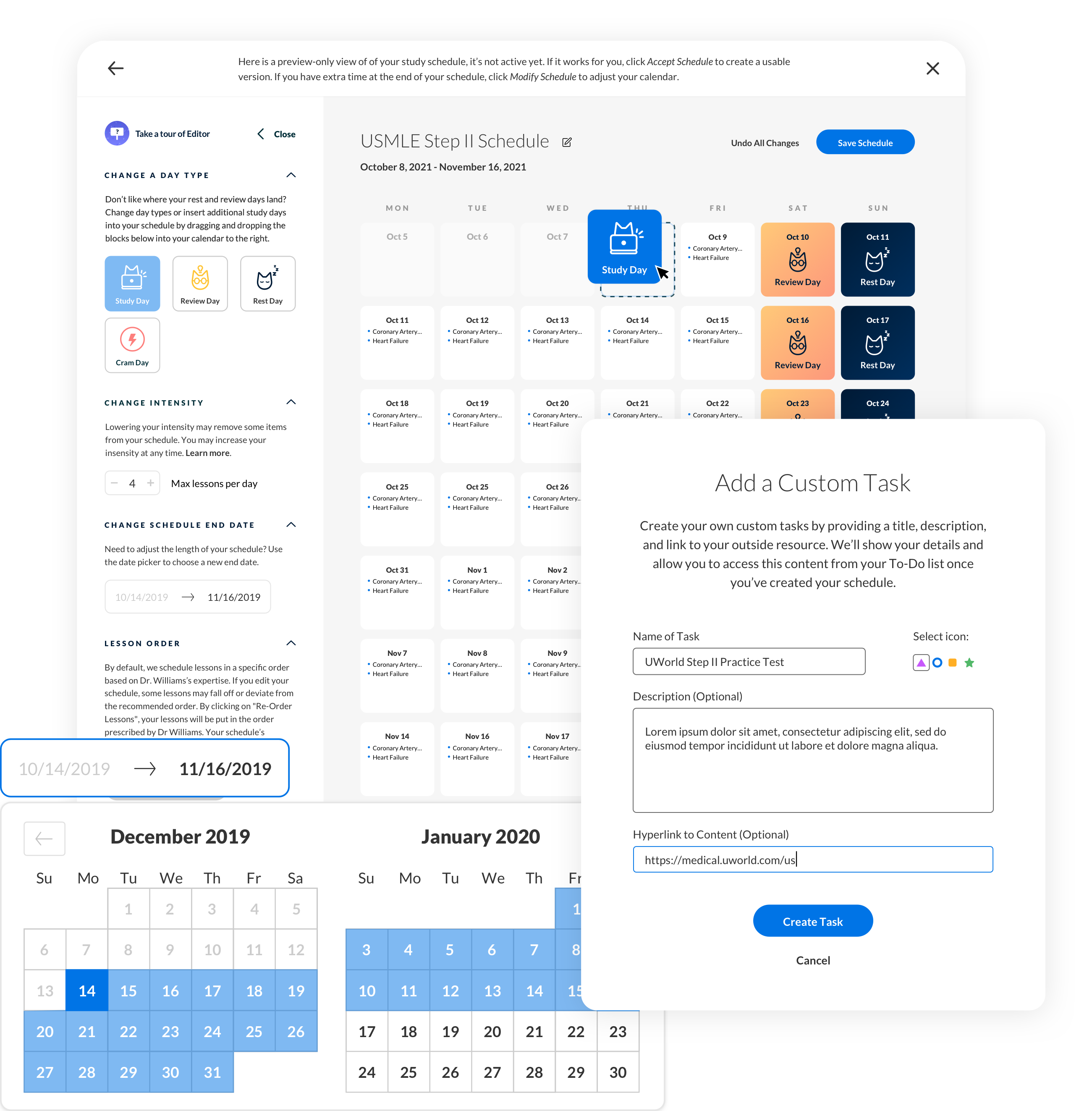
With scalability in mind, I made the editing panel separate from the calendar so the user could expand and collapse it if the user needed additional space. The pull-out menu also allows developers to add or remove functionality without affecting the lessons inside of the calendar preview.
During iteration testing, we added tools for custom content, lesson sorting, and removal of lessons for recently studied topics.
Capabilities
-
Drag and drop lessons to other days
-
Change day type
-
Adjust the volume of assigned lessons/day
-
Change timeframe
-
Add custom tasks
-
Add/remove lessons
-
Auto-filter recently studied lesson (past 30 days)

Scheduler Dashboard
Once a user saves a schedule from the editor, it lives on their dashboard and can be managed from one place. The dashboard is a key touchpoint for each registered user, so I wanted to utilize the space to get users into their preferred study content faster.
After gathering a hearty group of beta users, we experimented with clickable prototypes in the wireframing phase. This approach provided some excellent feedback in our beginning stages and helped us pivot towards a better UI that supported both the user’s and the company’s needs.
Process
- Version 1
The first idea was to display account activity using a grid that stacked content “blocks” that allowed the user to interact on hover; however, the Activity Overview proved unclear and unhelpful overall. - Version 2
Users were more interested in seeing their schedule vs. their activity. Putting each “to-do” list on date cards allowed the user to see all of their scheduled content at once using the Weekly/Monthly views.

To-Do List
The To-Do list is the primary tool for navigating and viewing scheduled content, so my goal was to make it prominent and accessible from anywhere on the site. Each lesson is broken into modalities of the “PACE” curriculum and automatically tracks your progress as you interact with each modality. If a user does not complete a lesson, it is moved to “Missed Lessons” and maintains Priority Order in each context.
Test
User Feedback
User Feedback
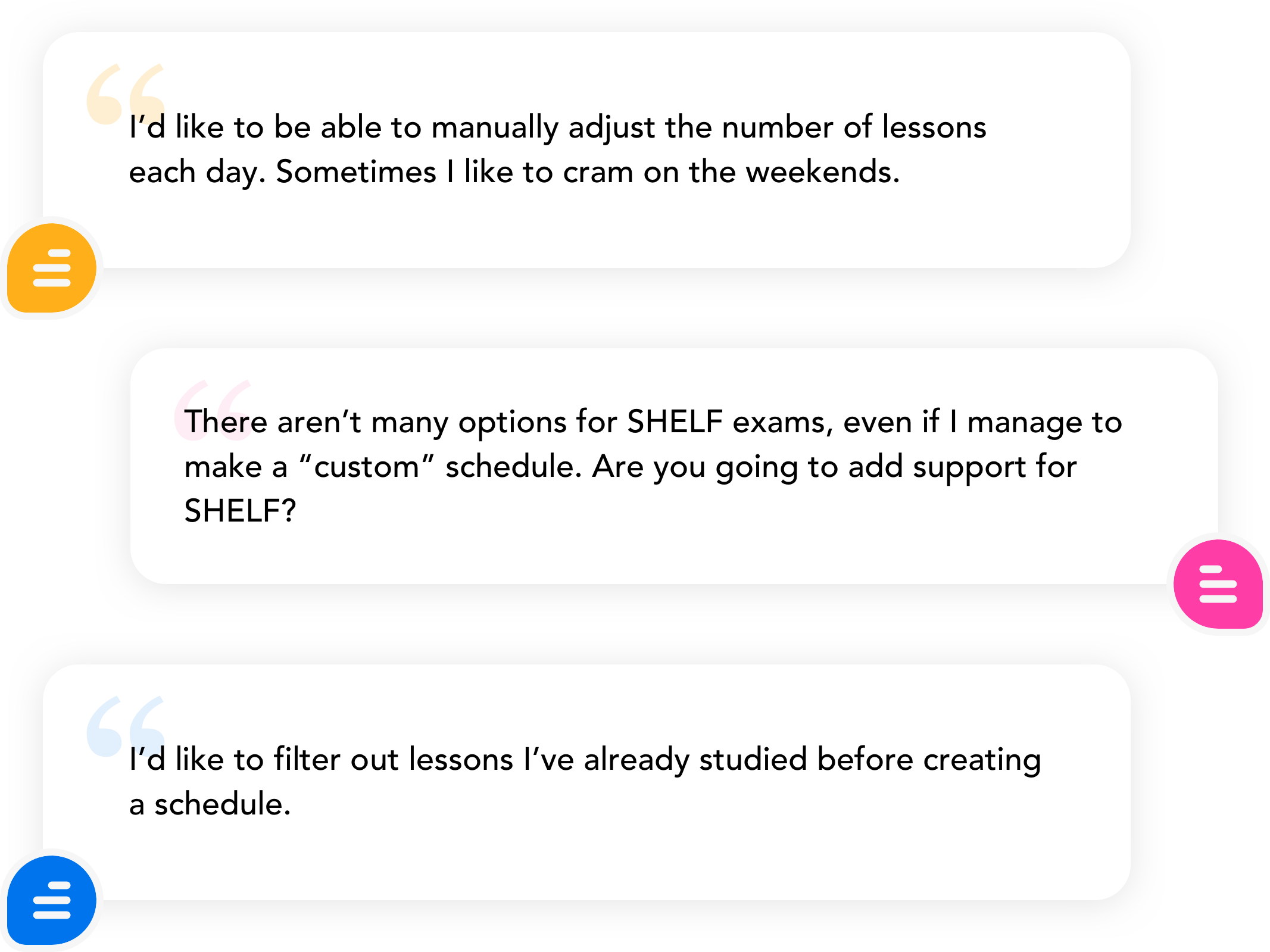
During beta testing, users strongly expressed a need to customize their schedules (which was not a feature at the time). We consolidated the feedback to build a robust set of requirements and considerations.
During beta testing, users strongly expressed a need to customize their schedules (which was not a feature at the time).
We consolidated the feedback to build a robust set of requirements and considerations.

Reflect
Conclusion
Months after Scheduler was launched, the data team recorded an average 30-40% increase in user activity for other products across the site (flashcards, notes, and question bank). It is now a core content delivery service and has been integrated into the overall experience of the user journey and opens up endless possibilities for prescribing and serving content to users.

%
Increase in subscription upgrades
%
