Mobile UX/UI Design
BaristaBot
for Briggo
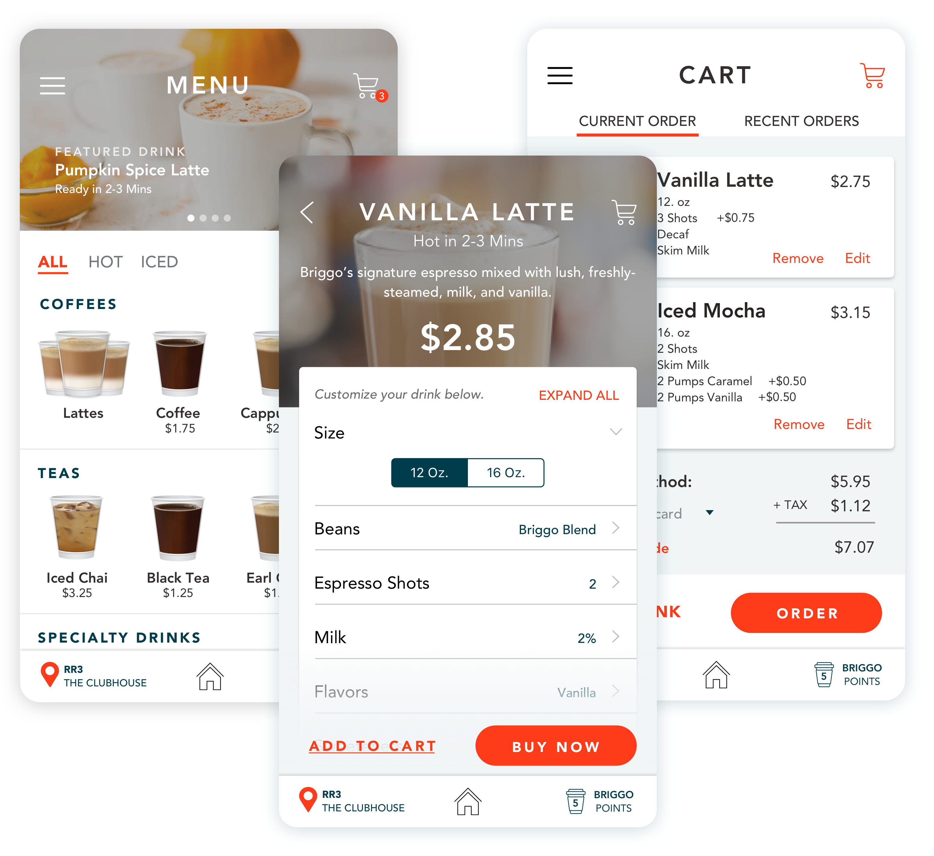
An Austin-based coffee robotics company wanted to improve the usability and update the design of its legacy mobile application for its automatic coffee kiosks to position itself for US expansion. I delivered updated brand colors, a complete UI system, and consulted on their ordering flow.
Overview
Briggo came to the table with their own market research and specific UX needs, so we started with a great customer data foundation. The main objective was to create a new design system and craft the UI towards action.
The Team
- VP of CX + Engineering
- Interaction Designer
- Lead UX Researcher
- UI Designer (Me)
My Role
- UI Design
- UX Consulting
Deliverables
- Updated Brand Assets
- UI Designs
- Order Flows
The Team
VP of CX + Engineering
Interaction Designer
Lead UX Researcher
UI Designer (Me)
My Role
UI Design
UX Consulting
Deliverables
Updated Brand Assets
UI Designs
Order Flows
Project Info
Challenge
Testing revealed usability issues with drink customization, cart flows, and checkout
Users were unclear on pick-up instructions for the machine kiosk
The branding & UI for the mobile ordering app needed an update
Solution
Increase order completion and sales (namely among first-time users) by optimizing cart and payment flows
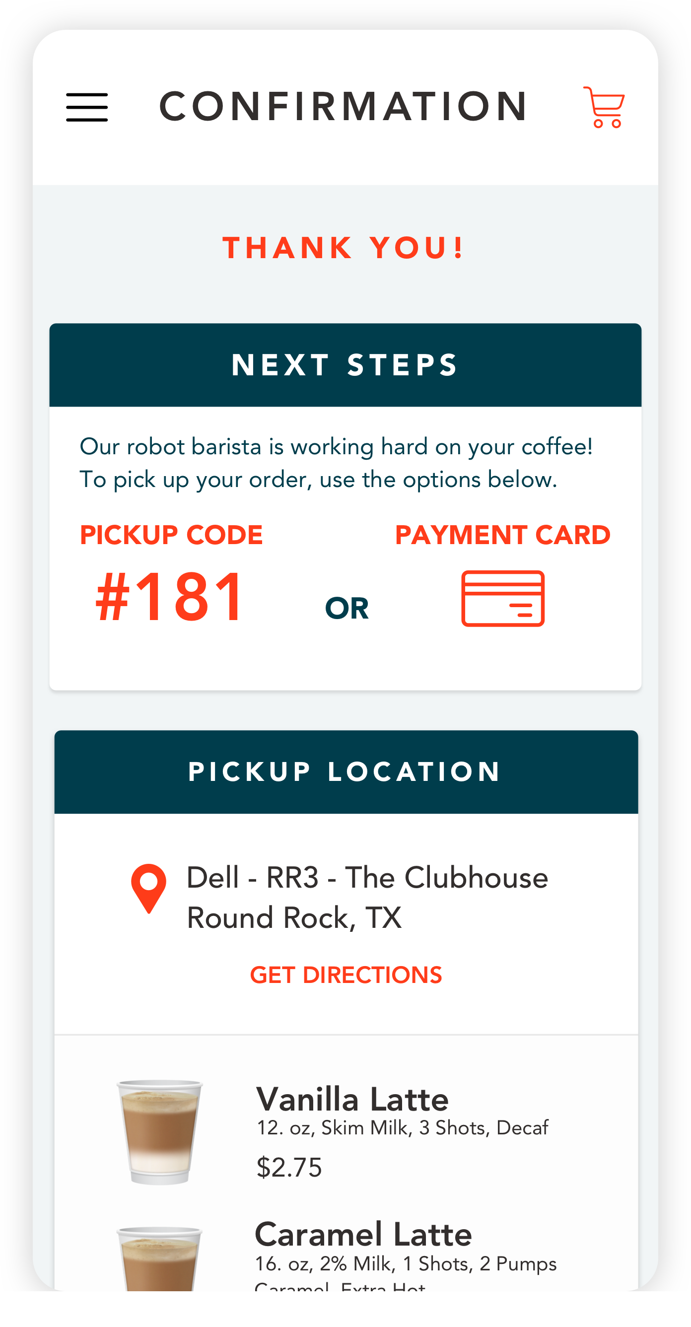
Create a seamless pickup flow experience to reduce support issues
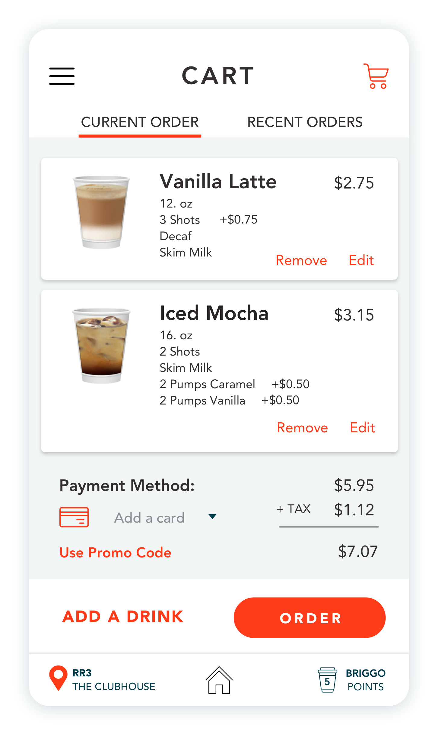
Enhance usability by creating a more simplistic and action-driven UI
Approach
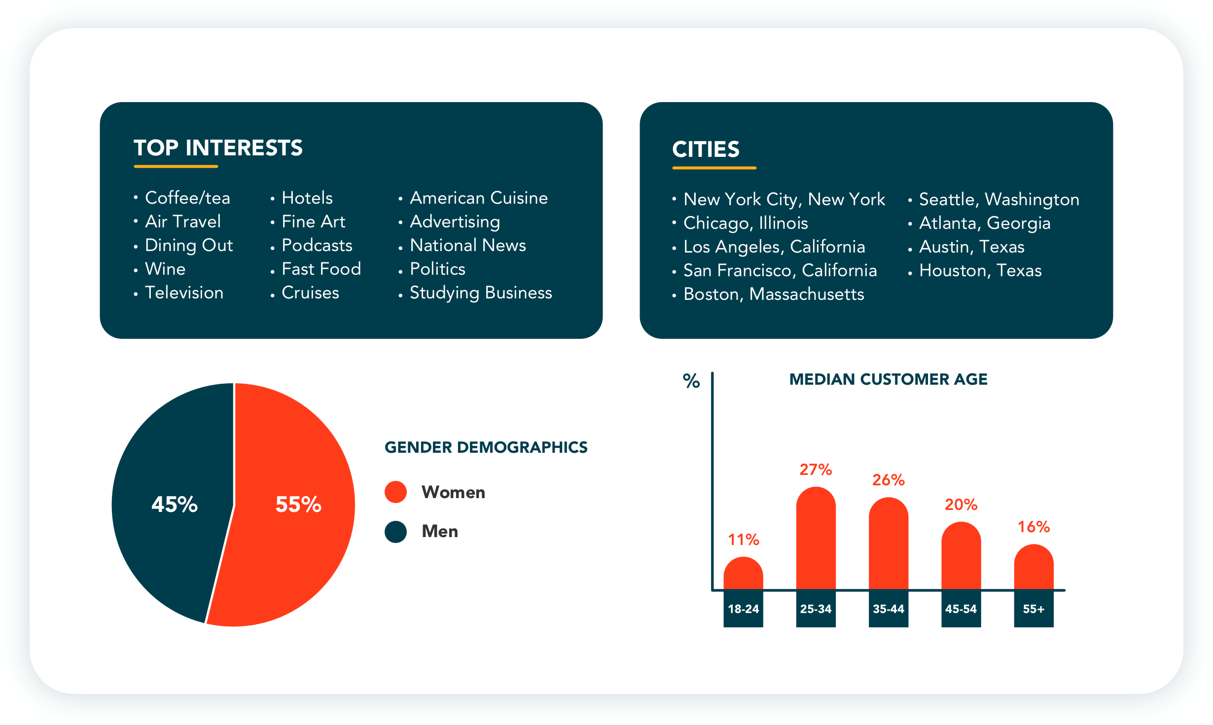
User Research
%
Drink customization across all users
%
Re-Order the same drink
%
Add more than one flavor syrup
%
Users between ages 24-55
Understanding the users
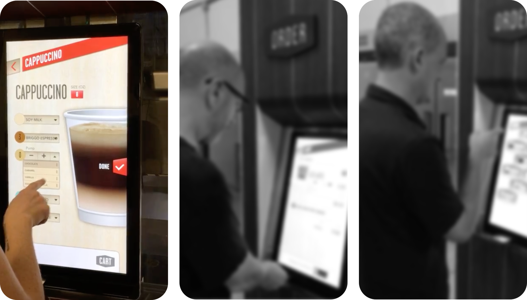
We set out to physical locations for the BaristaBot machines and asked users to walk us through their ordering experience. The drink customization screen required the user to double-tap through several drop-down menus and some users had issues scrolling through options.
Understanding the users
We set out to physical locations for the BaristaBot machines and asked users to walk us through their ordering experience. The drink customization screen required the user to double-tap through several drop-down menus and some users had issues scrolling through options.


Define
Design Planning
Design Planning
Brand Colors
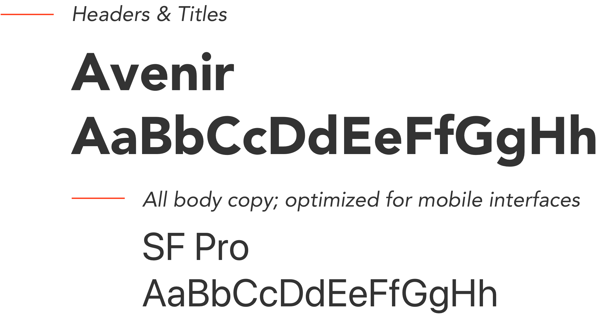
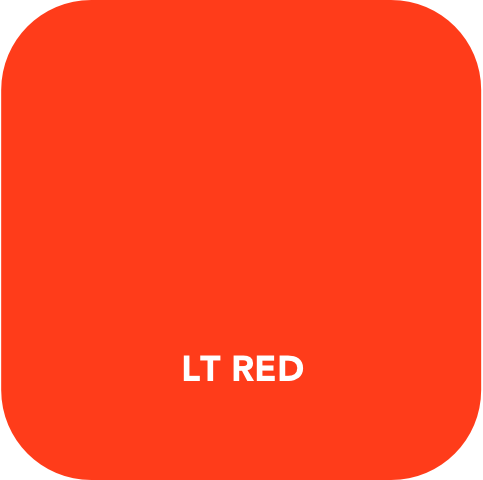
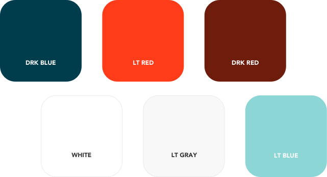
One of the core goals of the design was to make the app feel modern, punchy, and easy to use.
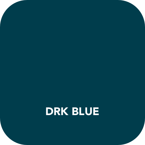
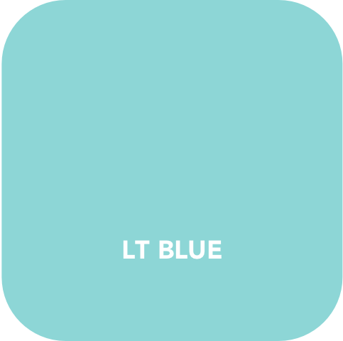
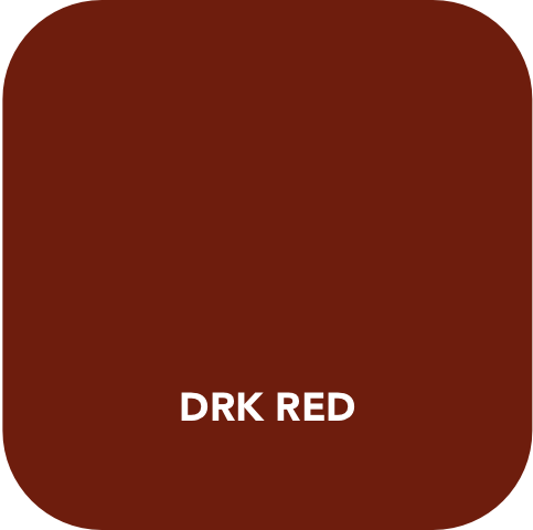
I wanted to maintain the core tenets of Briggo’s identity while updating the colors to feel brighter and more harmonious in context. Some of these considerations included adding cooler elements to match the industrial design and counter visibility issues in machine locations.



Define
User Flows
User Flows
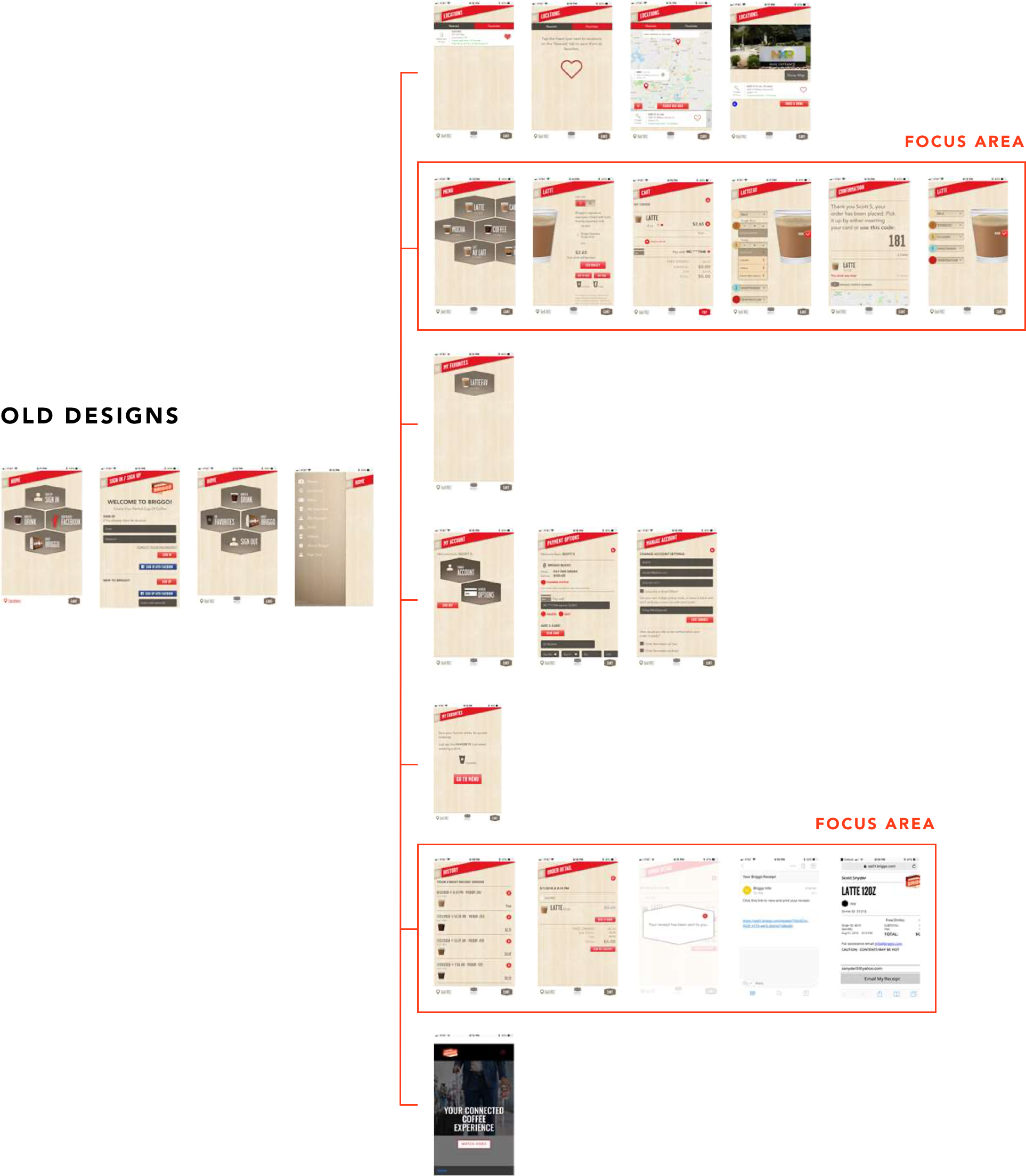
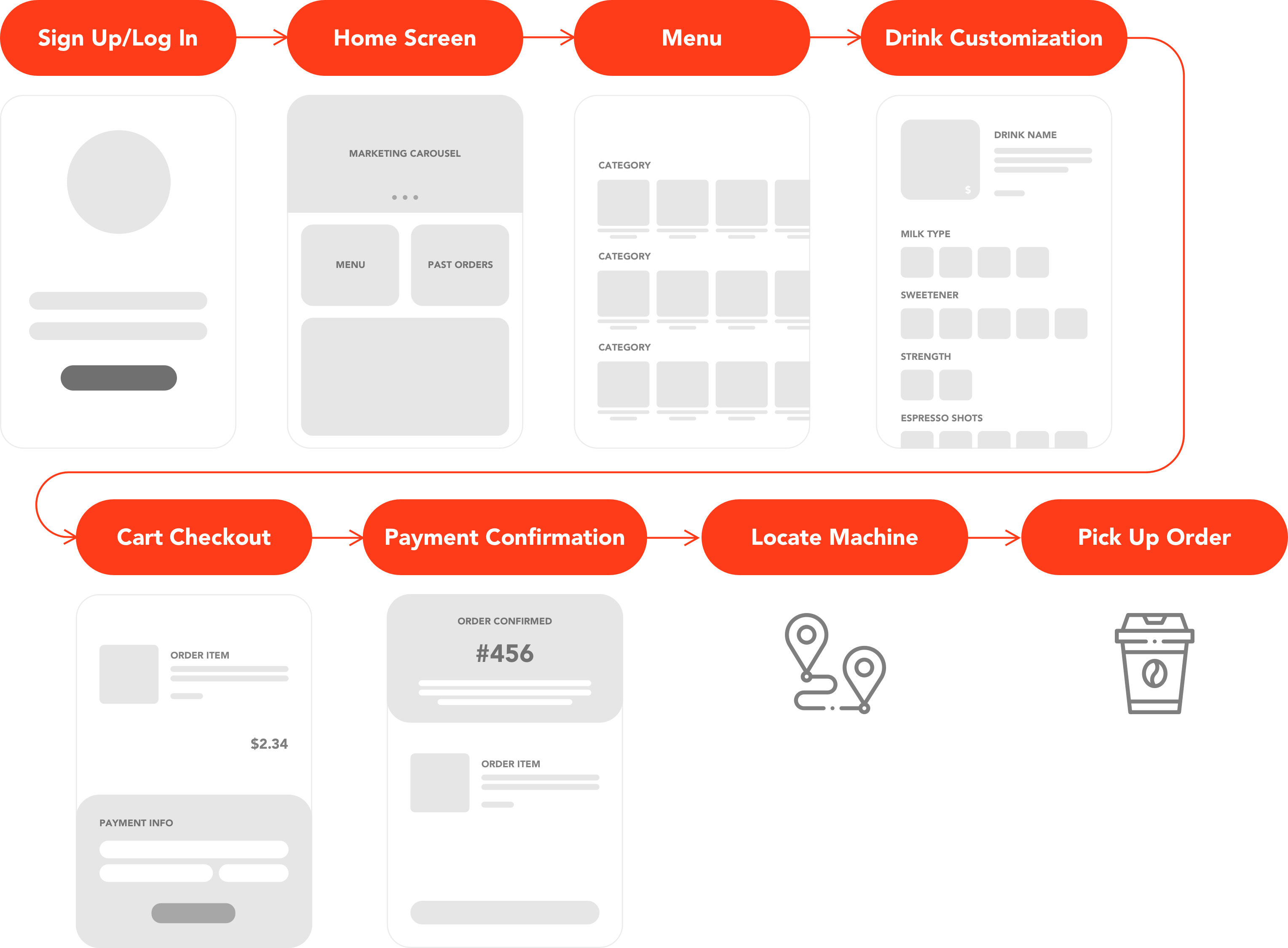
Mapping the existing app
After analyzing each screen in the ordering flow for their current app, we began to break down some key areas to focus on for UI and order flow improvement.
Compare
Competitive Analysis
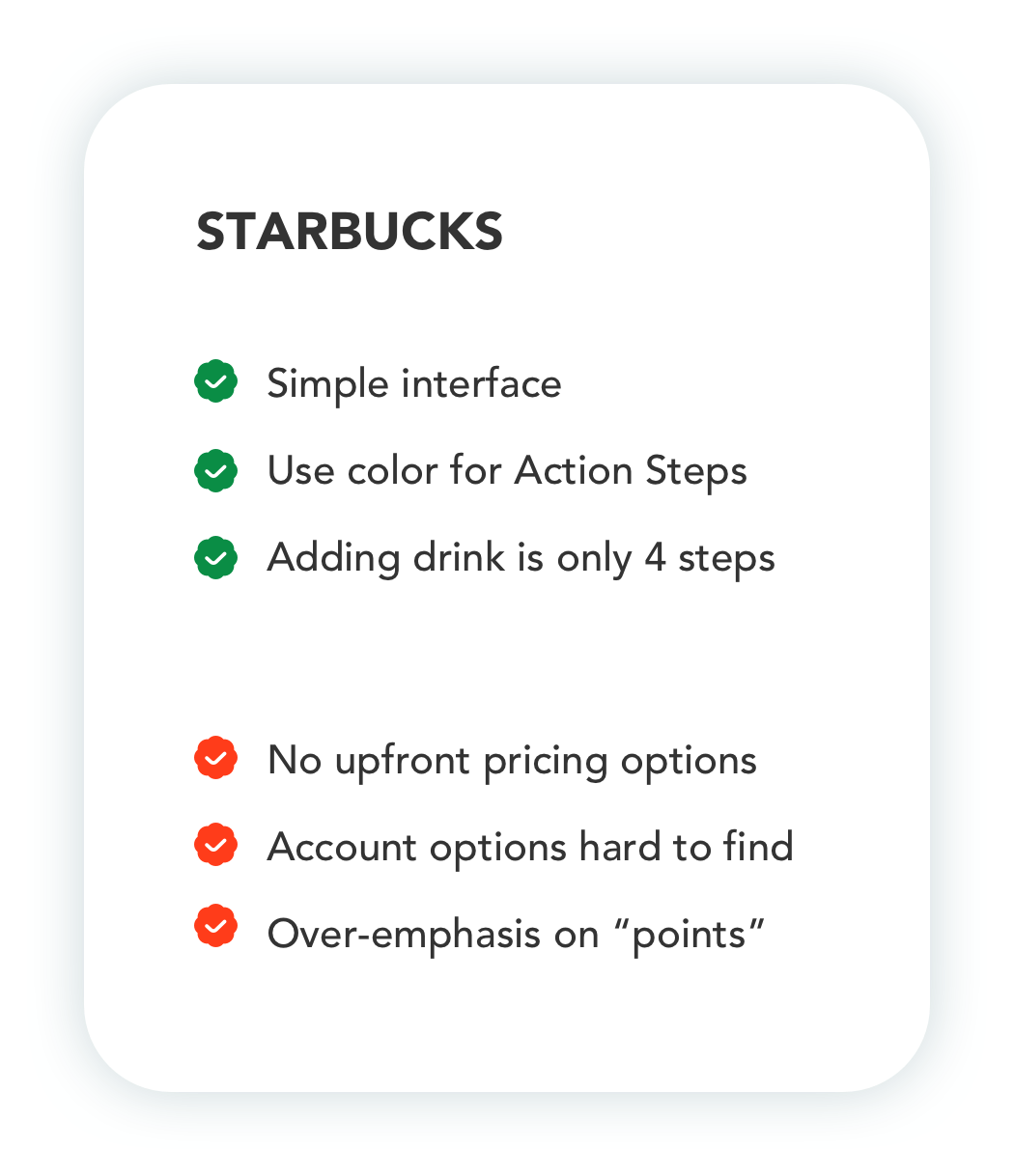
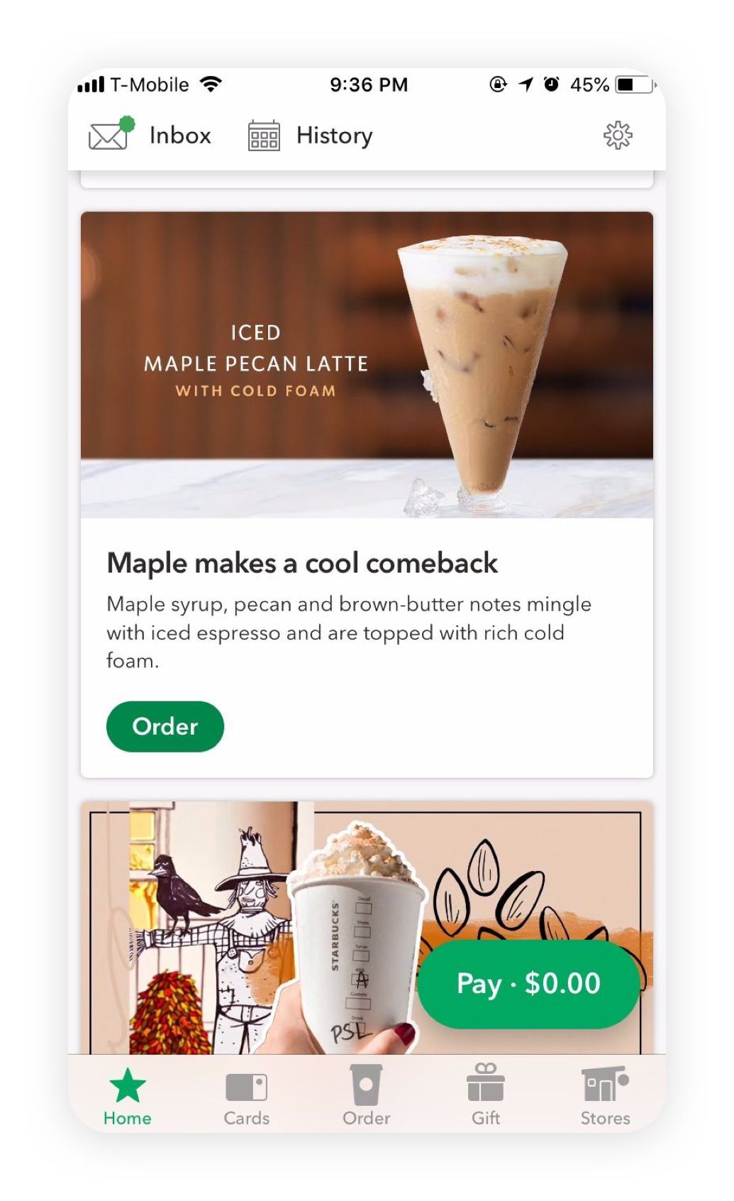
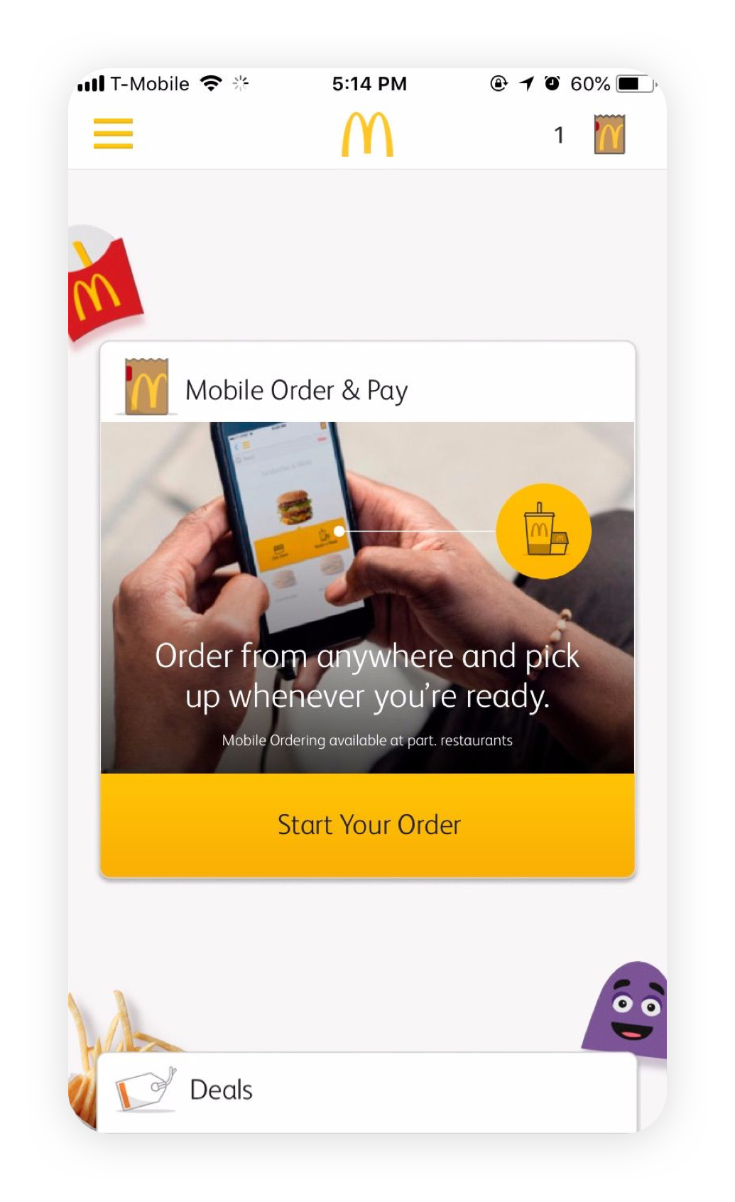
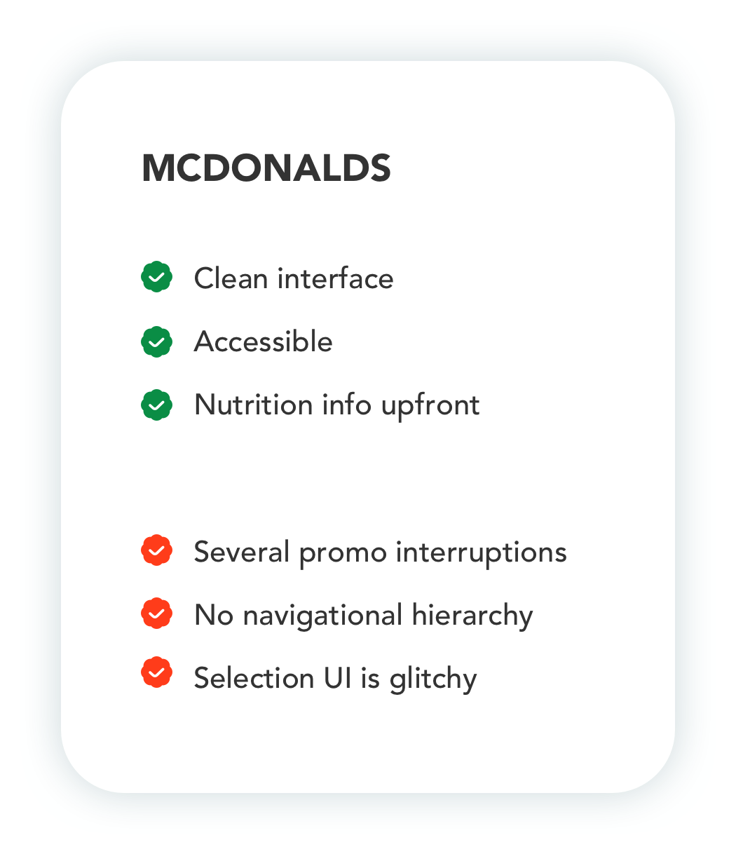
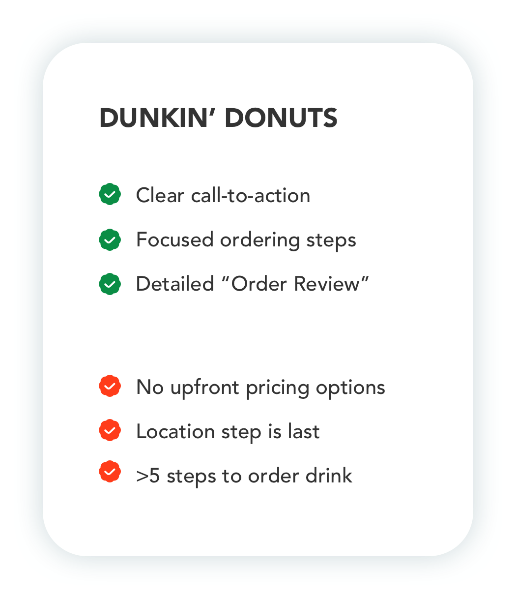
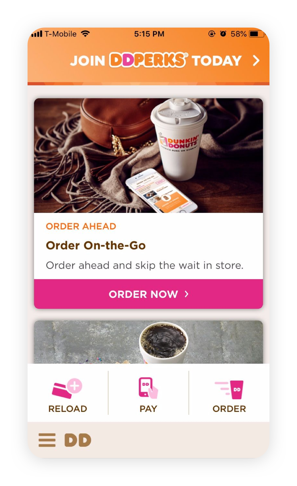
The timeline was tight, so we pored over competitor apps and broke down their design elements and flows, focusing on clarity, call-to-actions, and overall design appeal.
Compare
Competitive Analysis
The timeline was tight, so we pored over competitor apps and broke down their design elements and flows, focusing on clarity, call-to-actions, and overall design appeal.


Design
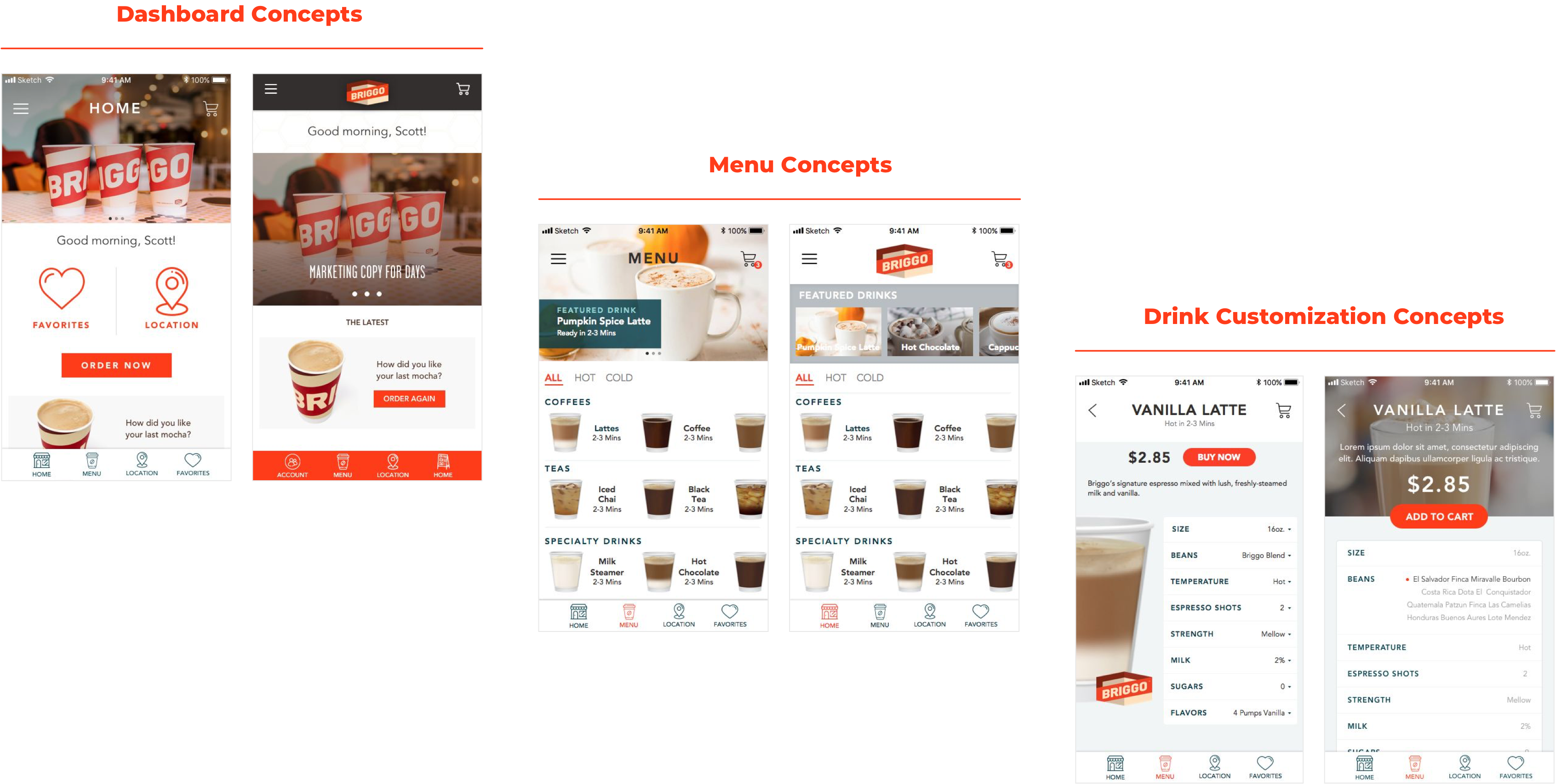
Early-Stage Concepts
Early-Stage Concepts

Design
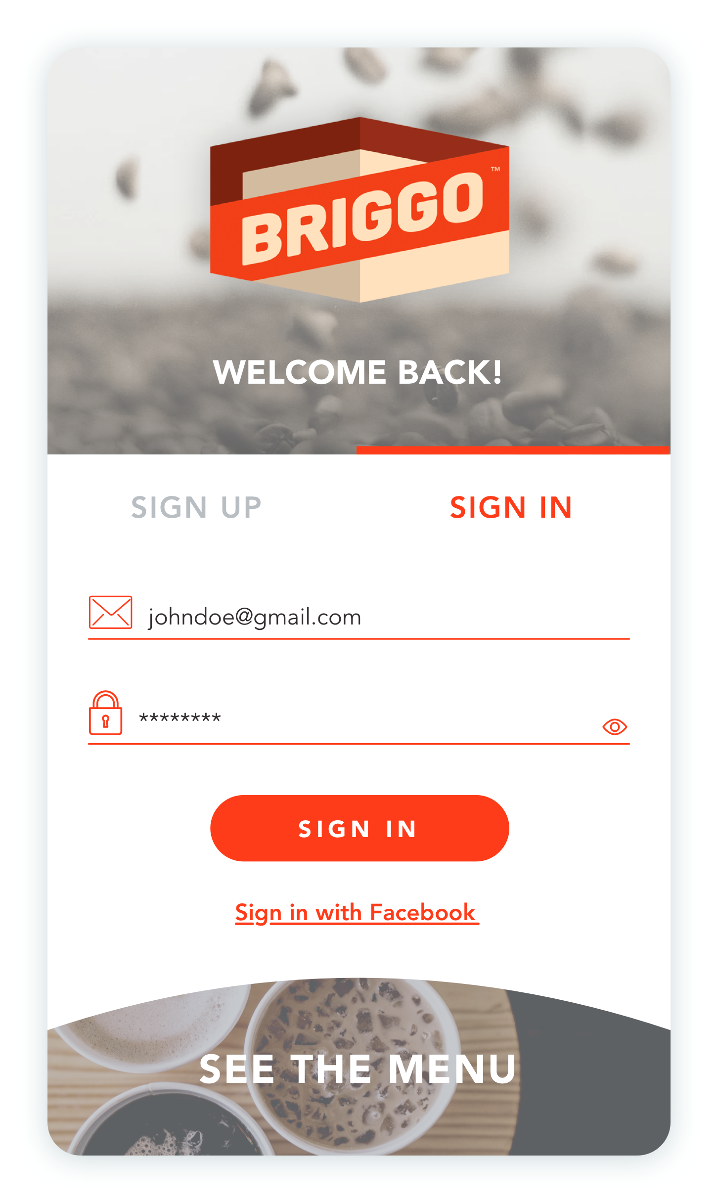
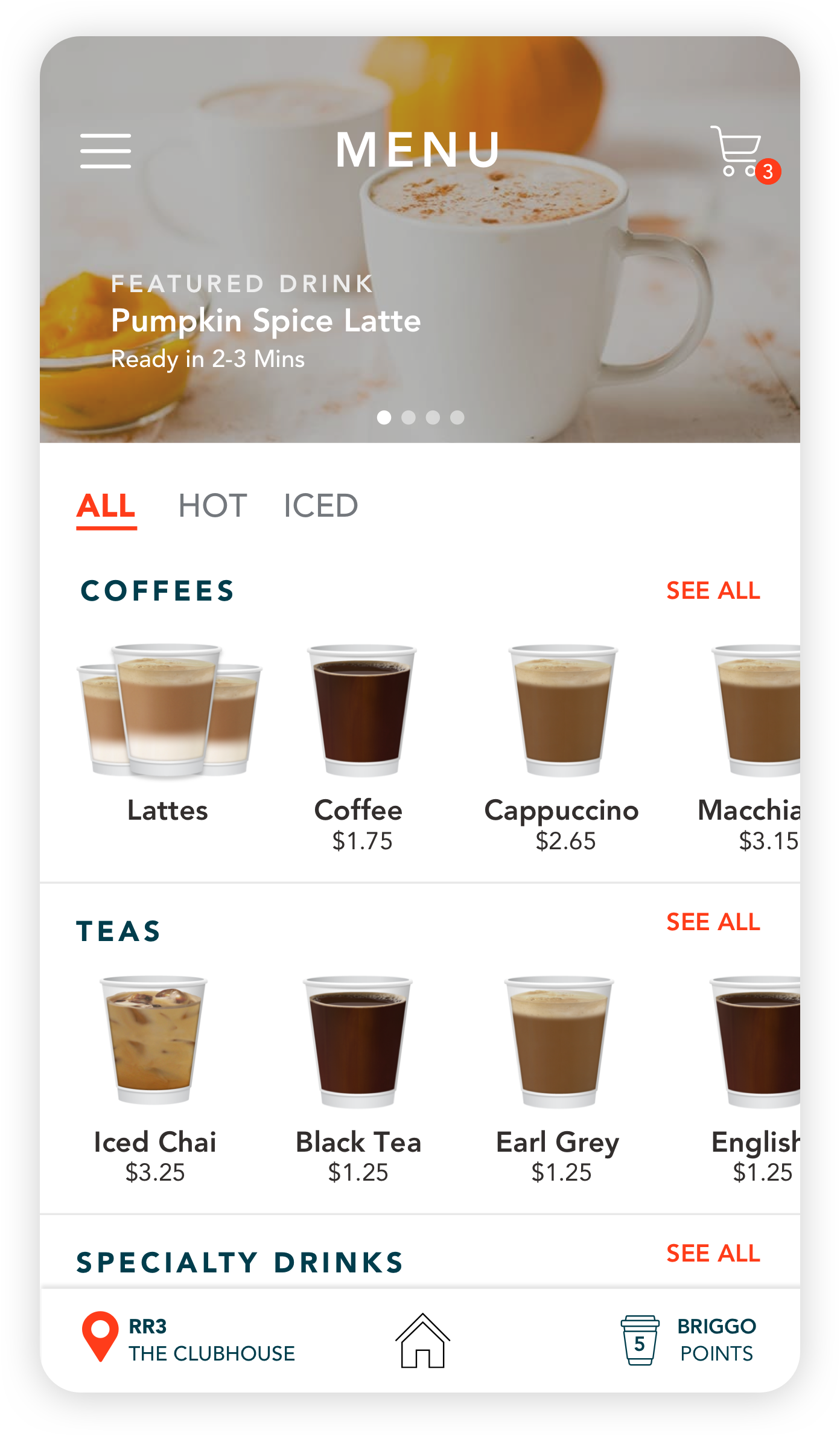
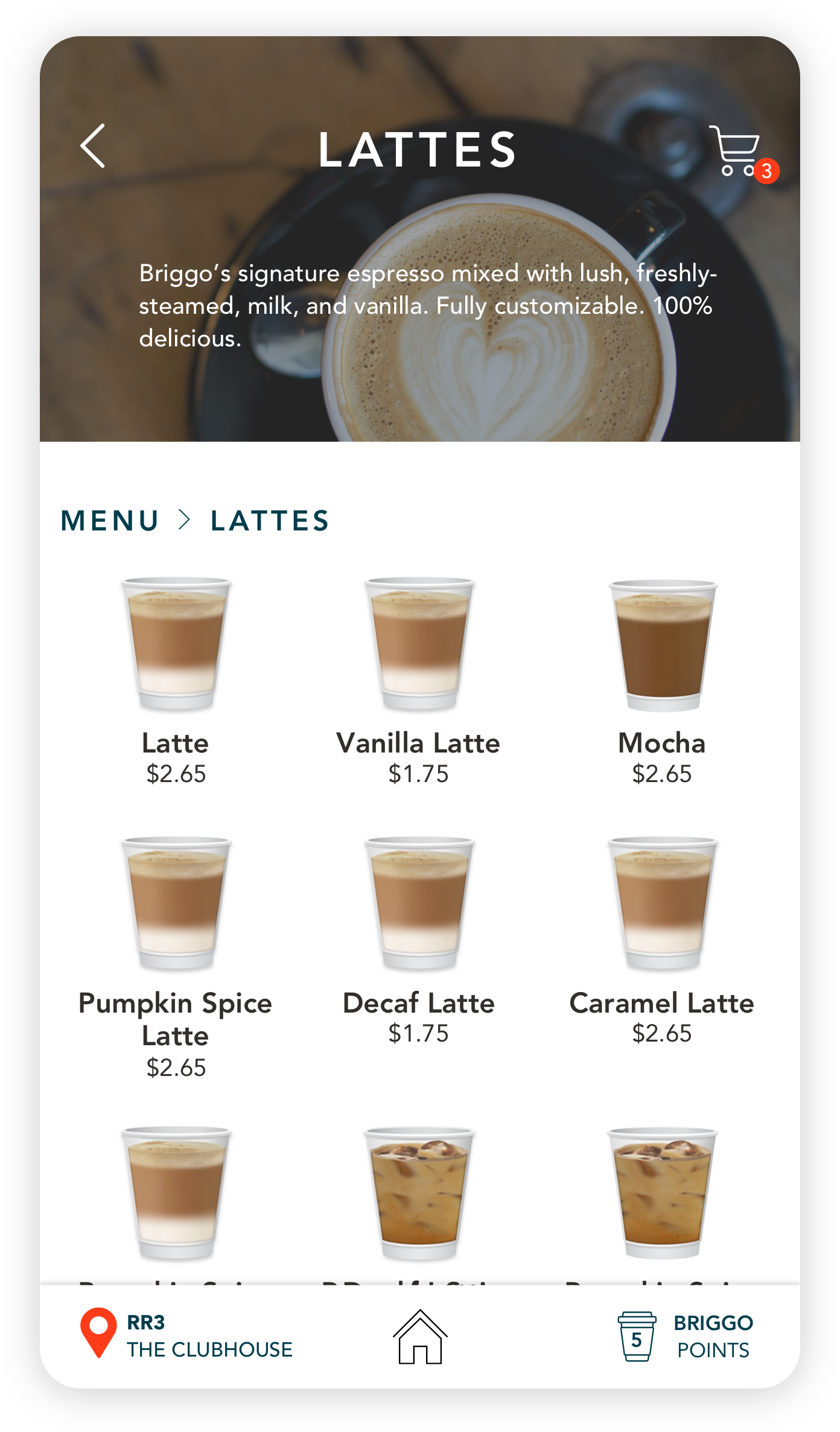
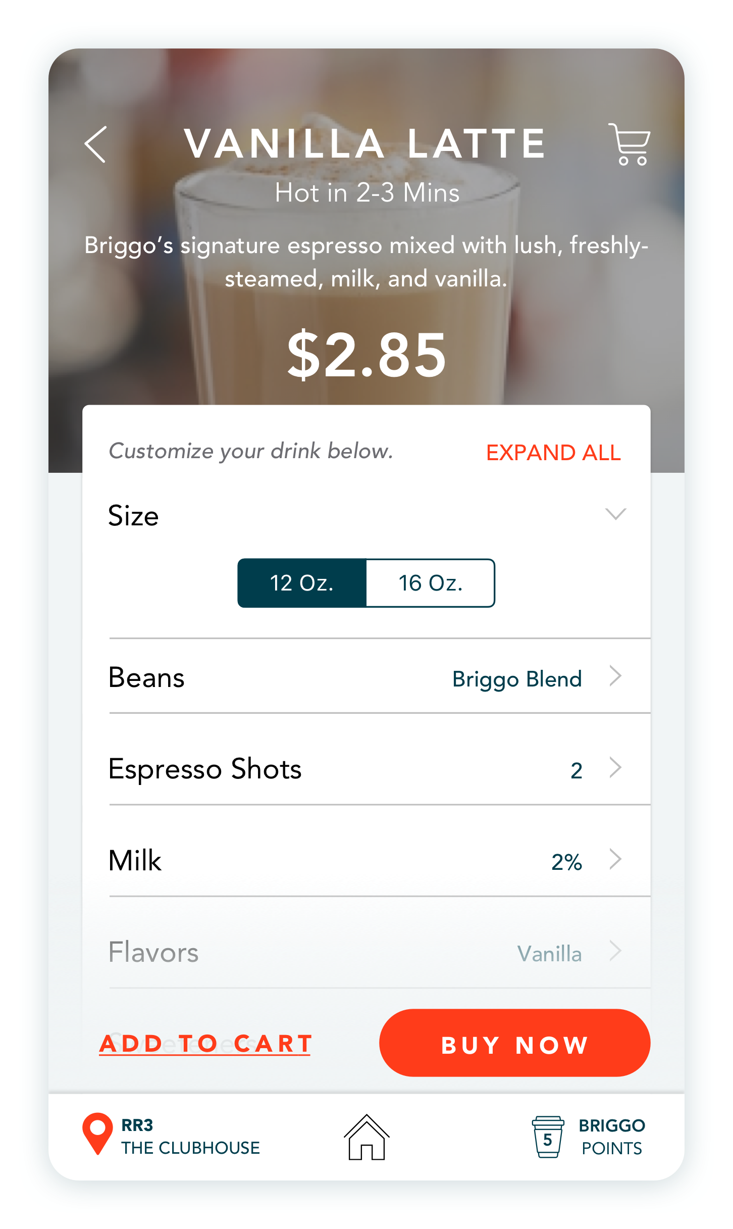
High-Fidelity Designs
High-Fidelity Designs
Design
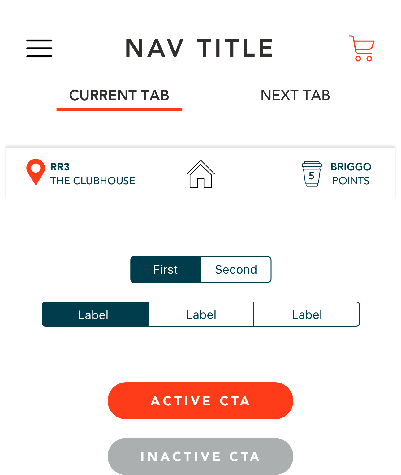
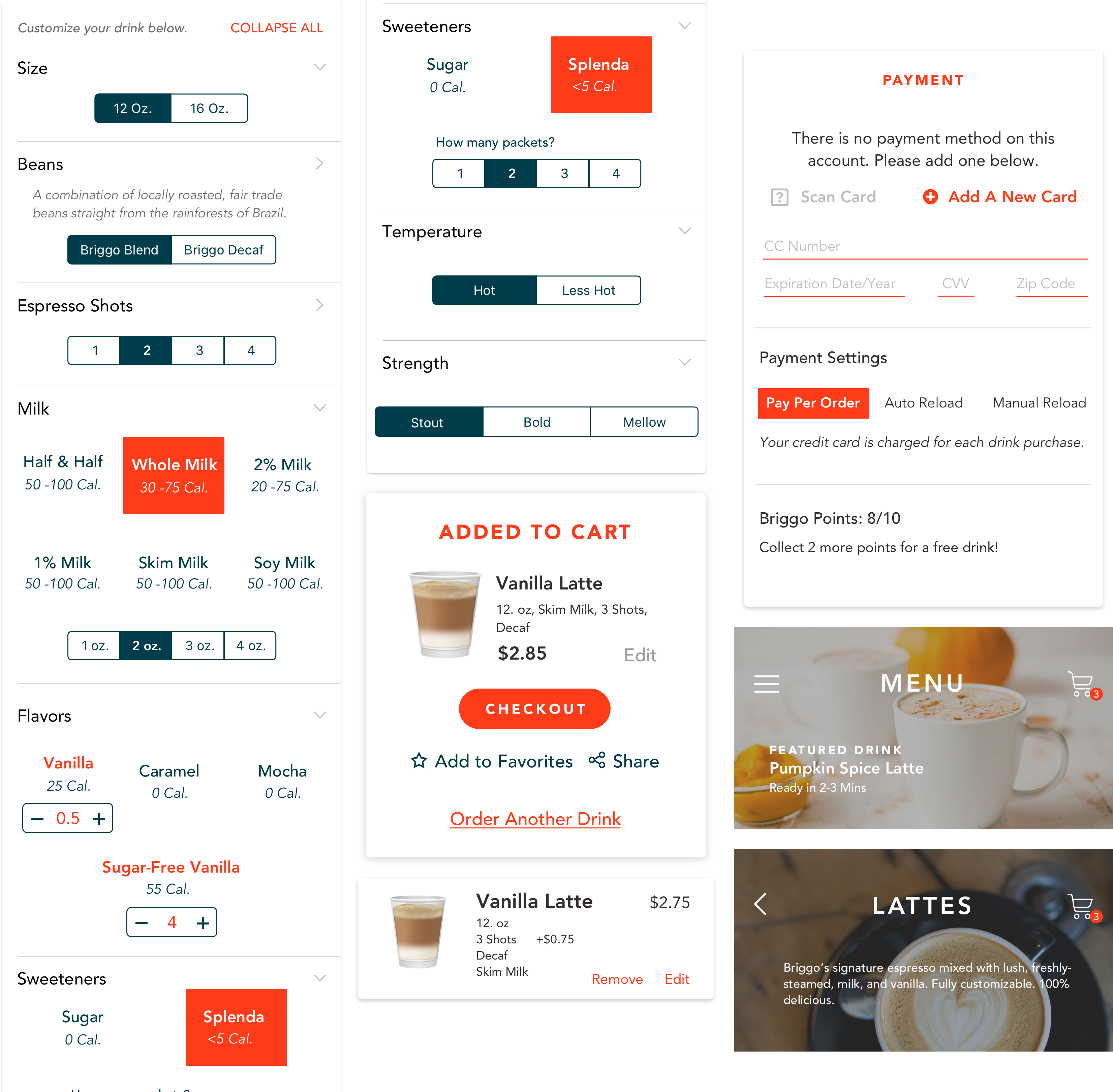
Design Components
Design Components
I used red in some selections (milk, sweetener, and “Add to Cart”) while keeping the rest of the UI components dark blue in order to minimize the “noise” and focus the user on required selections.
Reflect
Conclusion
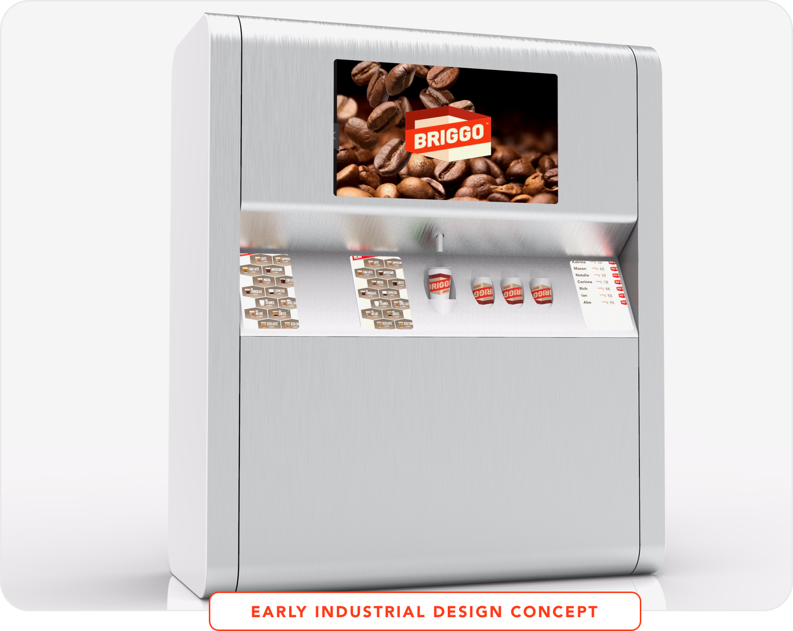
Within a year of making updates to Briggo’s ordering app, one of the world’s leading beverage giants purchased the company. The new parent company then approached us to make additional updates to their ordering flow for re-branded kiosks and consult on an updated machine design.
Conclusion
Within a year of making updates to Briggo’s ordering app, one of the world’s leading beverage giants purchased the company. The new parent company then approached us to make additional updates to their ordering flow for re-branded kiosks and consult on an updated machine design.
