Mobile UX/UI Design
The Flashcard App
for OnlineMedEd
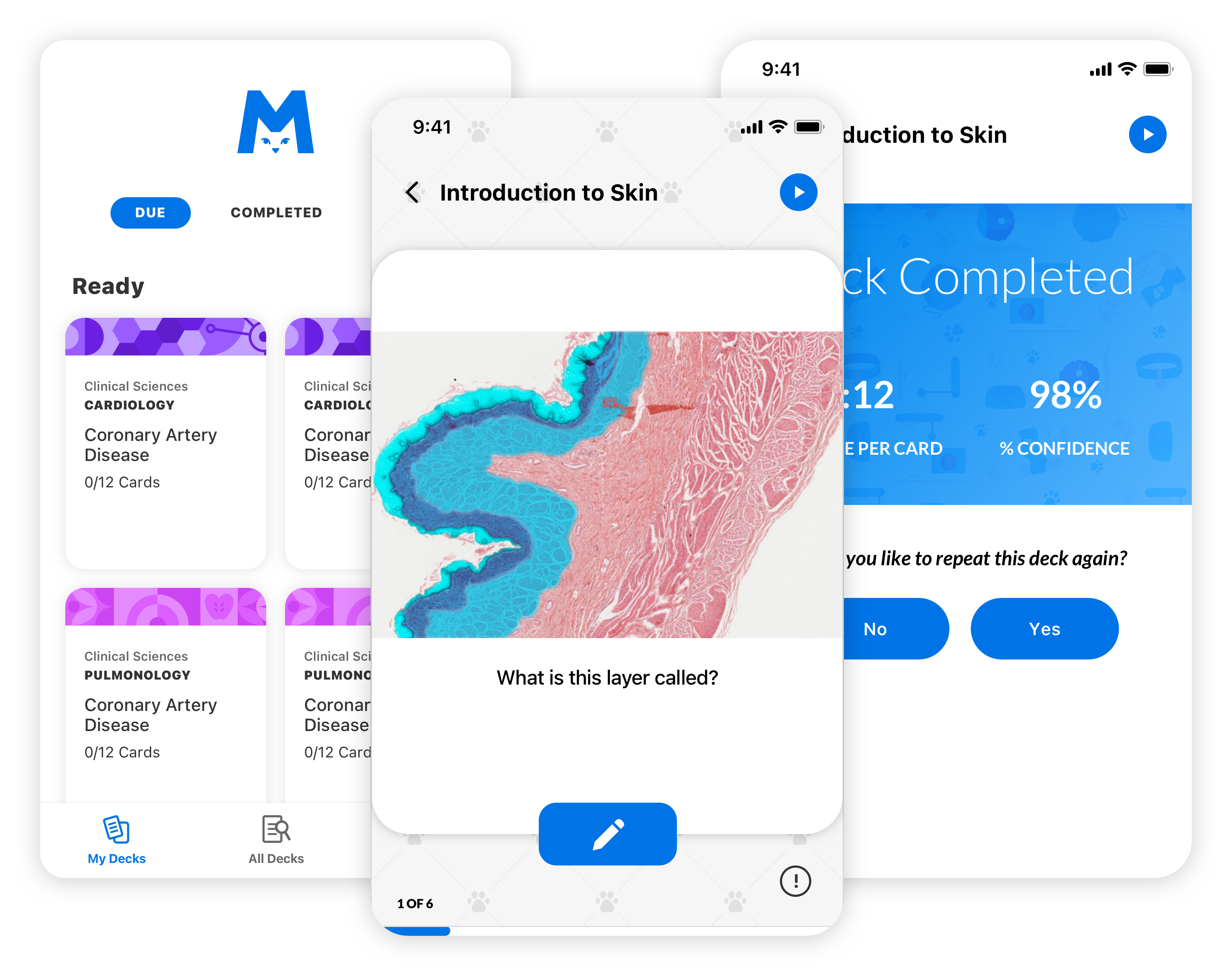
Most repetitive learning apps use content uploaded by users which can contain out-of-date or incomplete medical information. We wanted to solve that by providing flashcards that function in a similar way to the user’s favorite apps, while also providing peer-reviewed content alongside an established lesson curriculum.
Overview
The purpose of OnlineMedEd’s flashcard app is to serve as a key content touchpoint, delivering value by using one of medical school’s most common study mediums: flashcards.
The Team
-
3 developers
-
Product owner
-
Lead UX/UI designer (me)
My Role
- Lead UX/UI Designer
Deliverables
- User Flows
- Wireframes
- High Fidelity Designs
Other
- Design Documentation
Website
Project Info
Challenge
The existing mobile app for OnlineMedEd was created to provide all of their learning content in one app (video, notes, questions, and flashcards); however, technical issues made the app hard to use on iPad and it constantly crashed during use.
Due to OME’s learning methodology, flashcards are only available to users 48 hours after a lesson video was watched. We needed a way to communicate this approach and alert users when new decks are ready to review.
Solution
In order to reduce the support efforts for other content types, we re-designed the mobile app from the ground up to focus on flashcards.
Create a notification system to alert users when a new flashcard deck is ready
Approach
User Research
Competitive Analysis
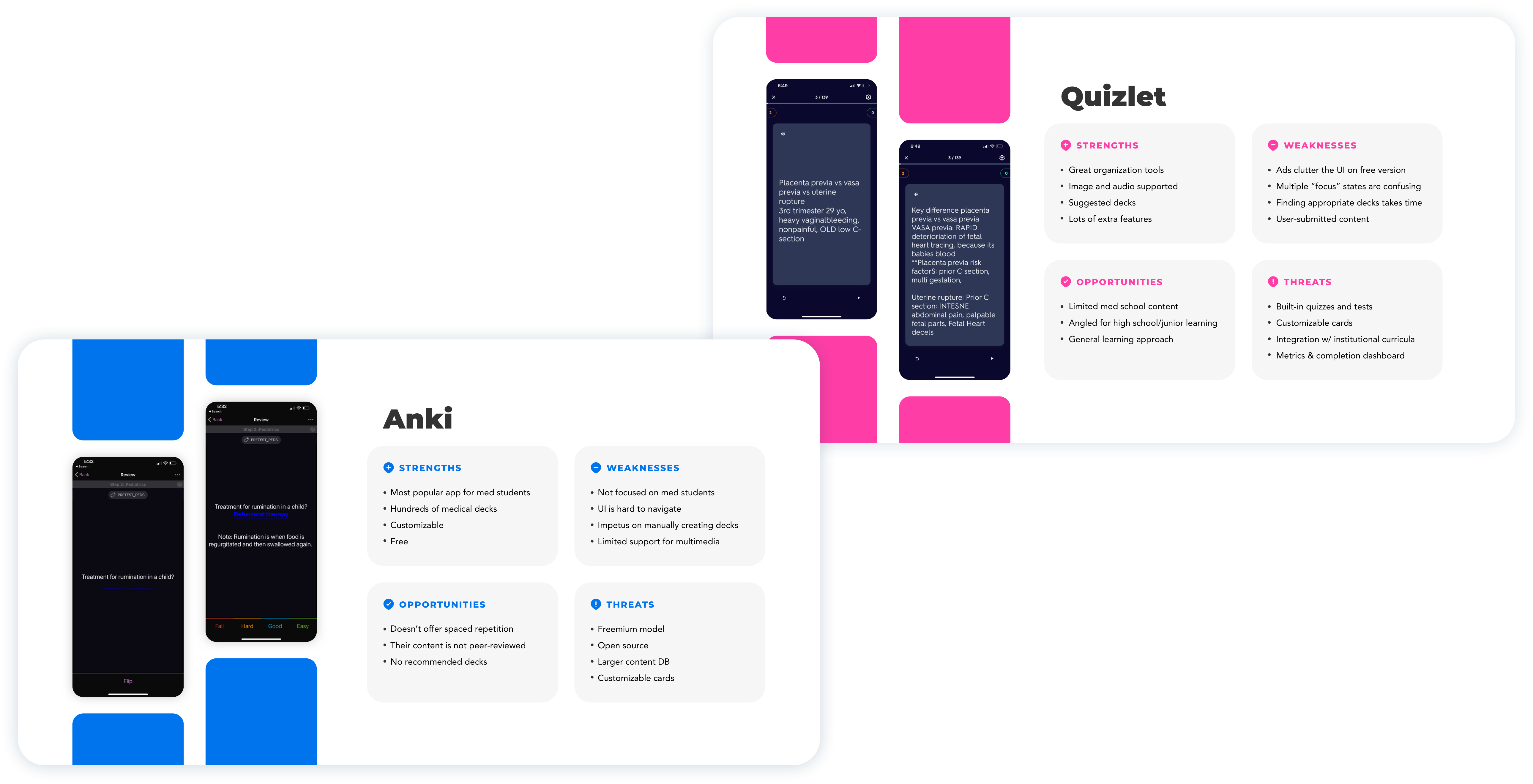
We looked at similar competitors in the e-learning and flashcard space to target areas of differentiation and frustration with other users. We knew we wanted to stay in-line with OME’s established curriculum while still providing value to Premium and Free users of the app.
Key Insights
-
Spaced repetition seemed to be a preferred feature for users and falls in line with how the OME curriculum is shaped.
-
Simplicity is key. Many of the flashcard apps we explored functioned similarly; however, navigation to specific flashcard sets was offset by a cluttered UI or a lack of information hierarchy.
-
Users want the option to find and jump into content quickly, so the navigation needs to be concise, simple, and to the point.

Define
User Flows
User Flows
UX Approach
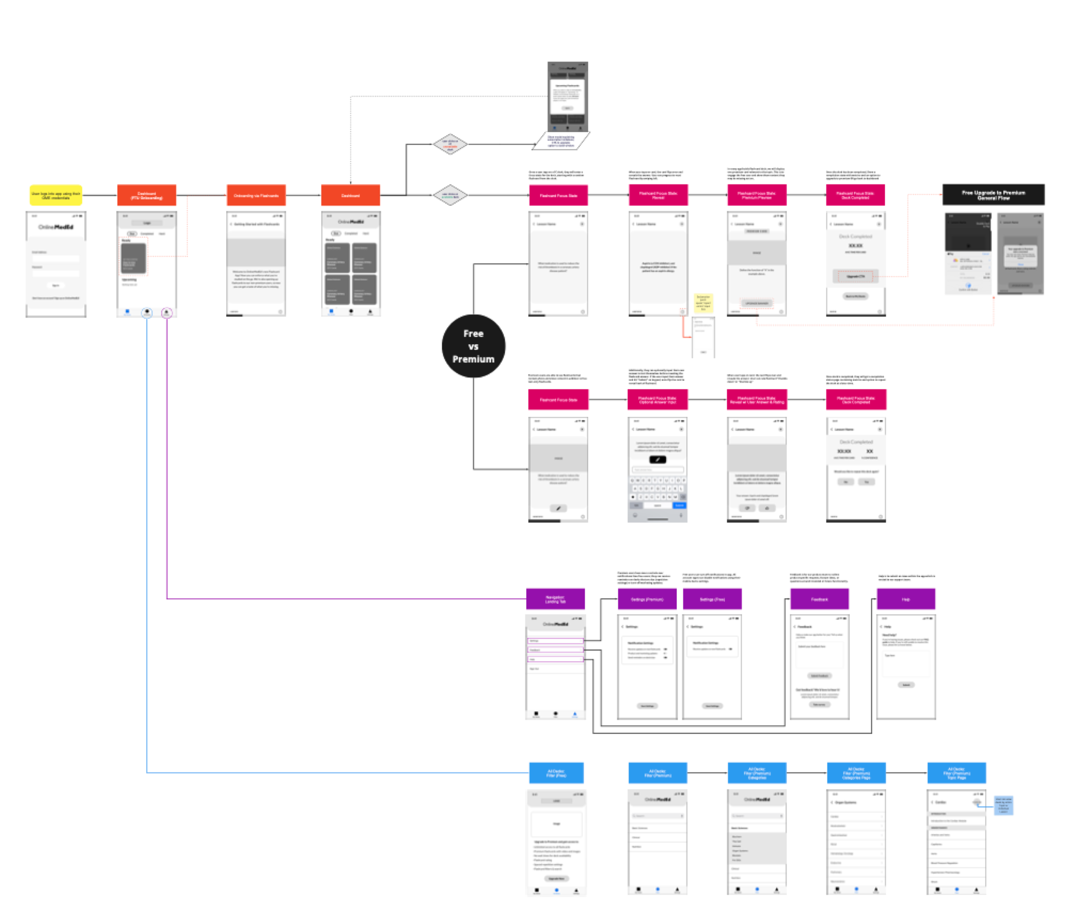
The timeline to complete the project was tight, so I started by mapping flows for the entire app, making sure to include caveats for in-app subscription upgrades, errors, and onboarding.
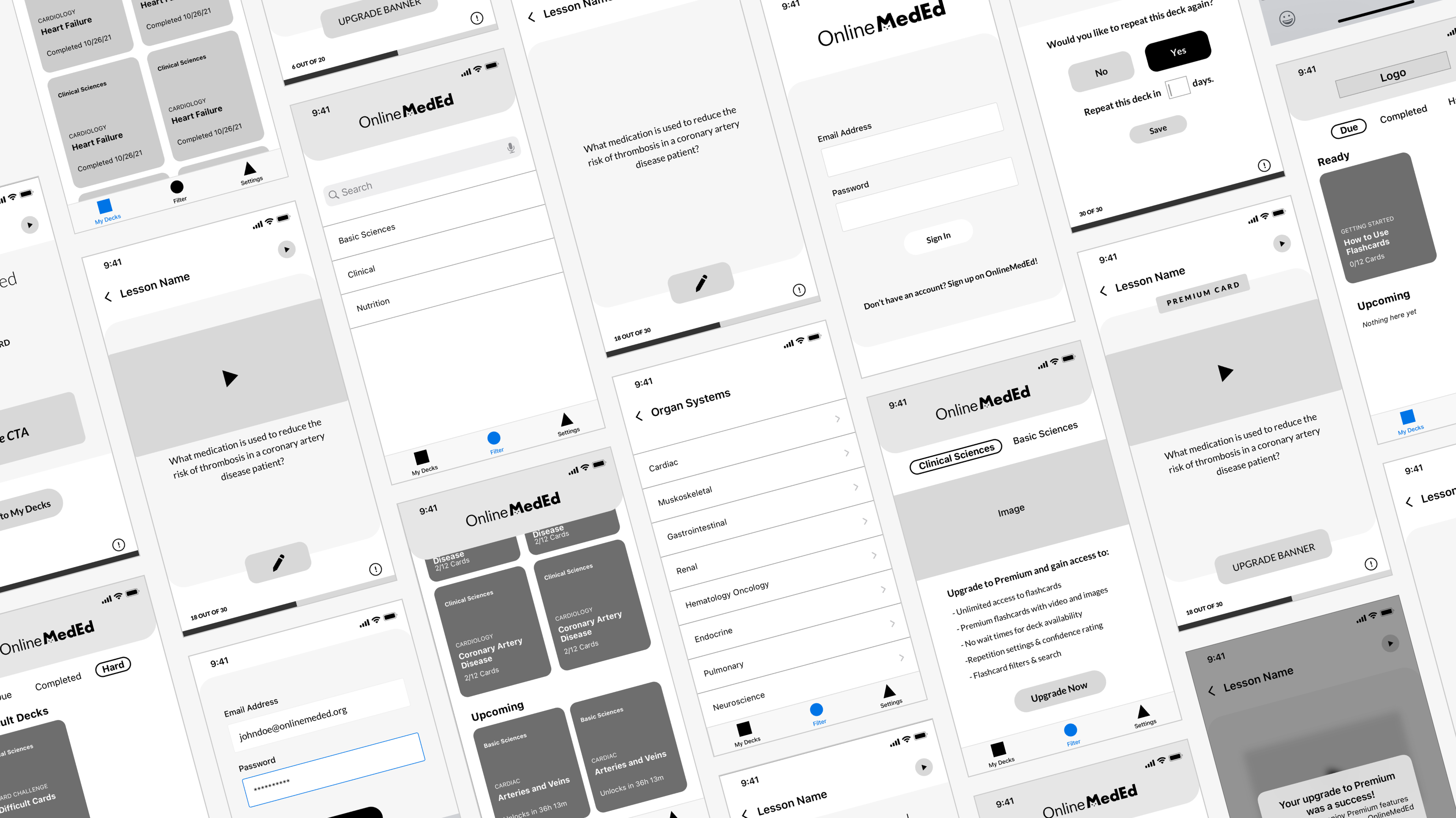
We worked with low-fidelity prototypes to tease out product functionality and collaborated with the engineering team on a backend approach to make everything work as intended.
Ideate
Wireframes
Wireframes
Design
High-Fidelity Designs
High-Fidelity Designs
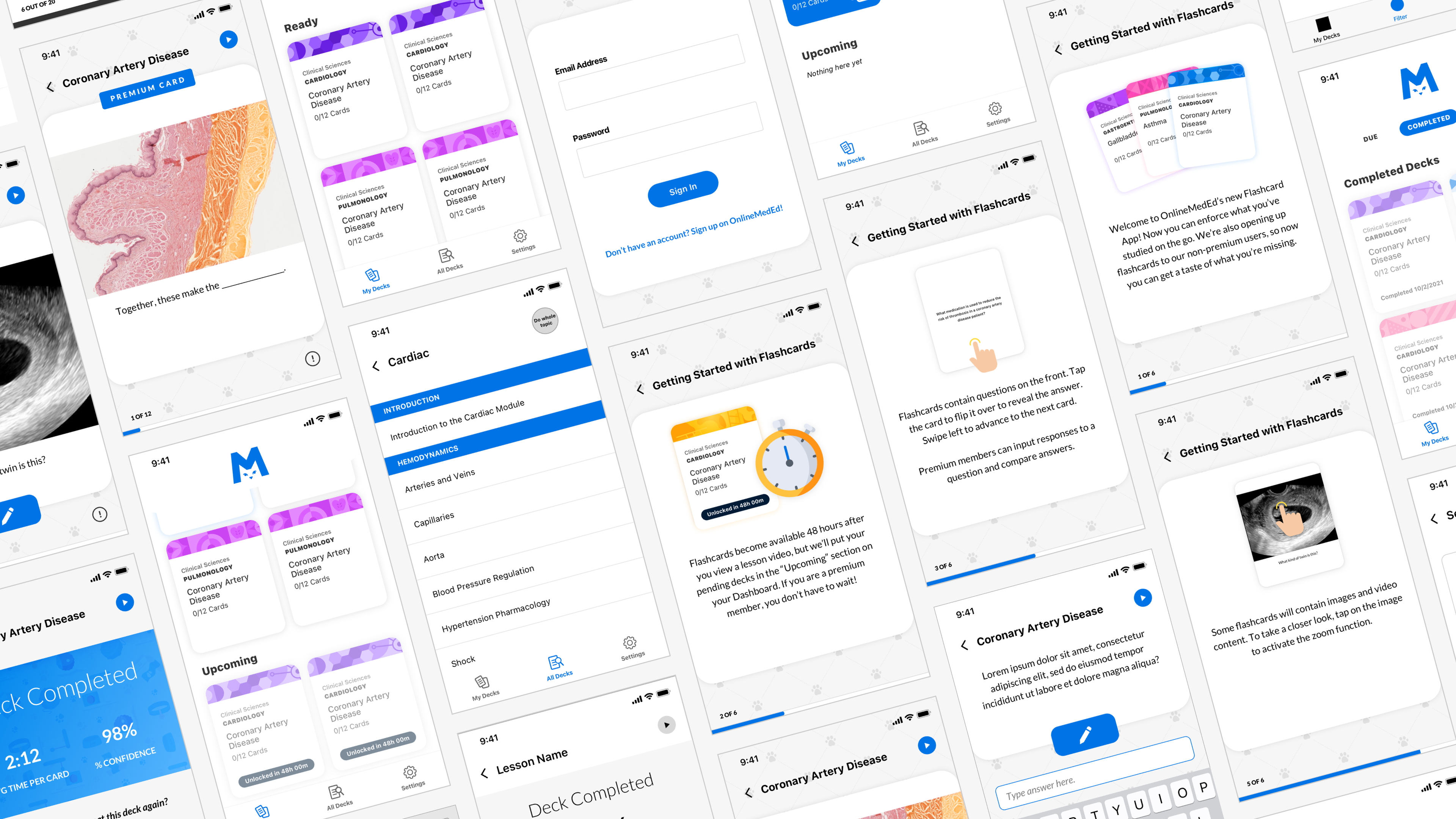
Design
Features & Functionality
Features & Functionality
Navigation
In previous flashcard app iterations, users noted that finding specific flashcards was difficult. To address this, we broke the dashboard into 3 main sections based on “Jobs to Do”:
– My Decks (Available flashcards)
– All Decks (Search & Filter)
– Settings (Manage account/app)
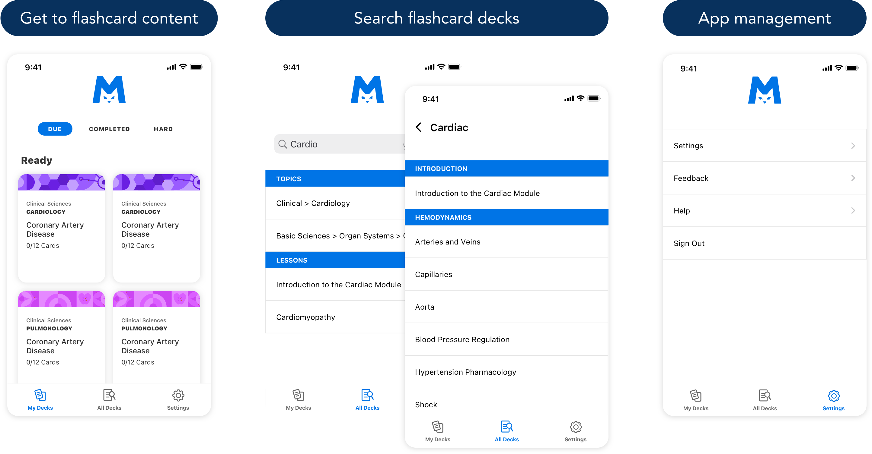
Navigation
In previous flashcard app iterations, users noted that finding specific flashcards was difficult. To address this, we broke the dashboard into 3 main sections based on “Jobs to Do”:
– My Decks (Available flashcards)
– All Decks (Search & Filter)
– Settings (Manage account/app)

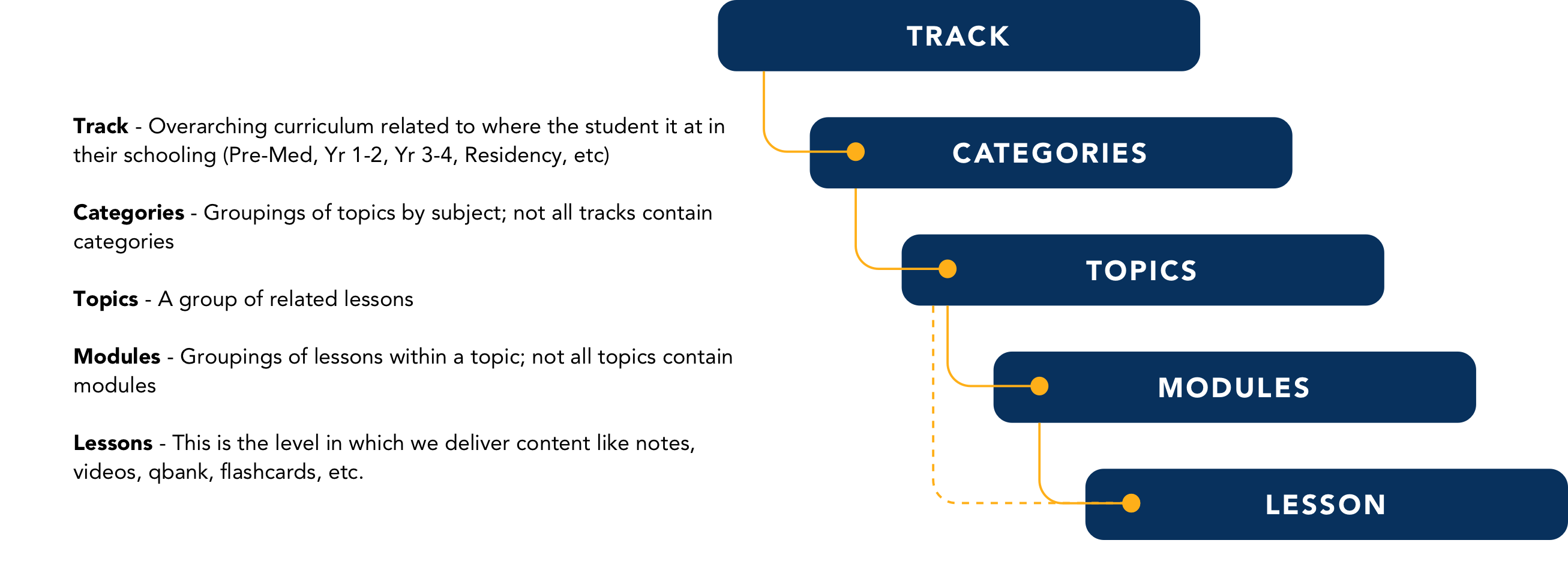
Search & Filtering
Search was a robust part of the application and we had a lot of user feedback on. Most users had a hard time differentiating between learning tracks to find the right topics. I put together a content taxonomy to define how search could work and how we can update our terminology for internal (and external) teams to understand how to navigate the topic and lessons.

Content Scaling
We learned quite a few lessons from our previous mobile app iterations. The first lesson was that iPad users made up 30% of total app users across the board. We needed to optimize and scale the content for use on larger screens.
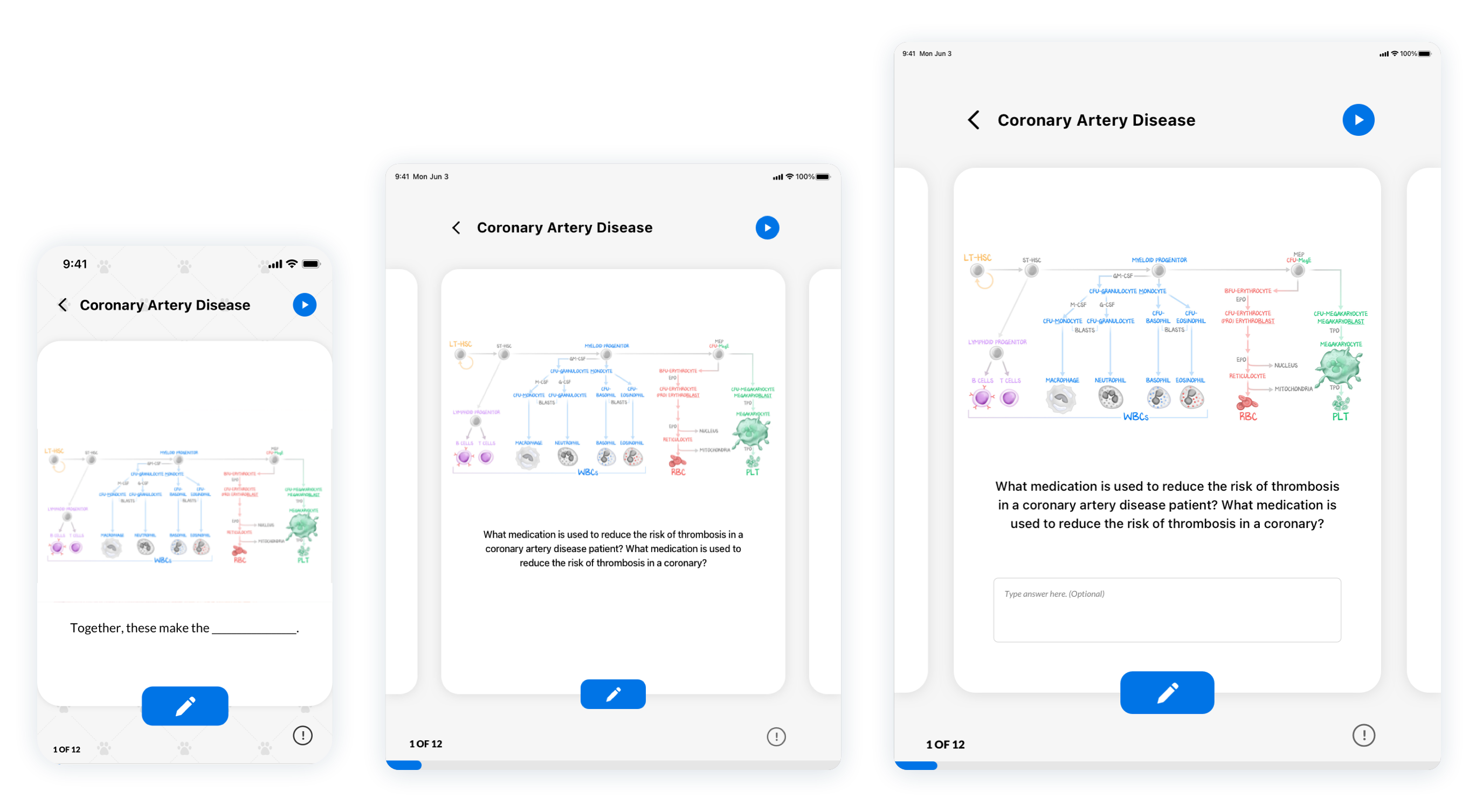
Content Scaling
We learned quite a few lessons from our previous mobile app iterations. The first lesson was that iPad users made up 30% of total app users across the board. We needed to optimize and scale the content for use on larger screens.

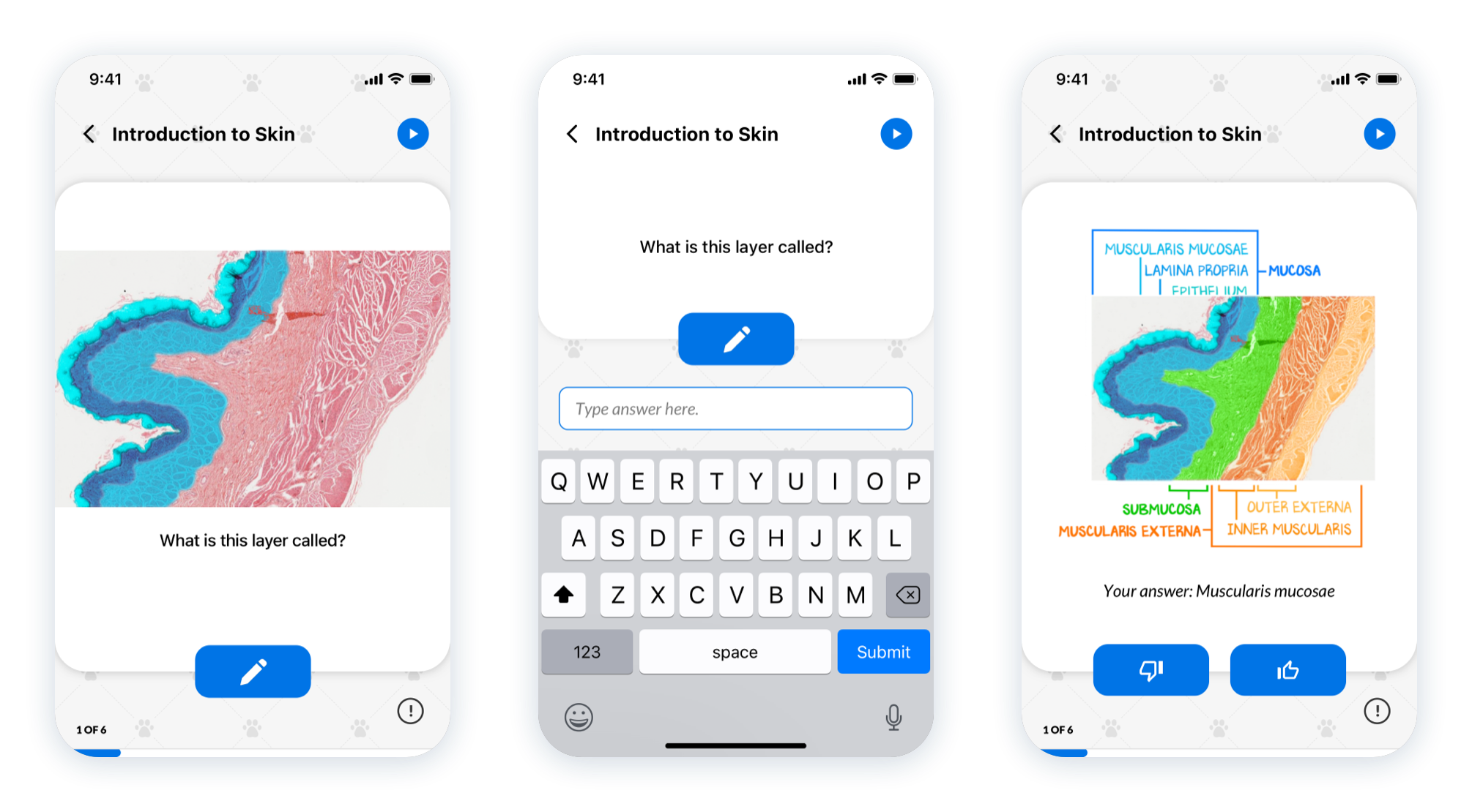
Answer Comparison
According to research on learning and memorization, writing things down tends to commit more things to memory. I added an option to input an answer and comparison tool for users to compare their knowledge against the cards.
Answer Comparison
According to research on learning and memorization, writing things down tends to commit more things to memory. I added an option to input an answer and comparison tool for users to compare their knowledge against the cards.

Reflect
Conclusion
The design deliverable on this project was focused around UI designs and UX documentation with the implicit goal of soft-launching with beta users. The project did not make it to user testing due to conflicting product initiatives; however, the core architecture, designs, and documentation were fully packaged and handed off to a third-party agency for implementation and were well-received in the org.


